
>> Creativity in cartography
This section presents project of map´s creativity realized at the Faculty of Science (Charles University in Prague) incl. the resulting “creative maps” created from 2007.
Basic aims of the project
1. to look for creative thinking of authors of maps in the times of computer era (individuality × uniformity of machine-aided solution);
2. to initiate and support creative thinking already during the education of cartographers, i.e. at universities;
3. to achieve the above mentioned issues by producing tangible results in the form of maps supporting creativity (hereinafter referred to as “creative maps”).
The project’s position and context
1. the project is part of a long-term effort to apply knowledge concerning aesthetics and related fields of study in cartography and cartographic production; it has been incorporated in the project “Aesthetics in Cartographic Expression“;
2. the project fully accepts major goals of the working group ICA Art & Cartography, i.e. “explores the art element of cartography: facilitating and encouraging interaction between cartographers who work with the art aspects of cartography and artists who produce cartographic artefacts; developing theory on art and cartography and cartography and art” (Art & Cartography 2008).
The procedure - realization
1. before the assignment of the task to produce a creative map there is a lecture on creativity possibilities within current cartographic production (Bláha 2008);
2. the task contains three basic possibilities which the students can choose:
a) create a map that will make use of one of known artistic styles (e.g. symbolism, realism, impressionism, expressionism, pop art, geometric abstraction);
b) create a map by using one of known artistic technique or more of them (painting techniques, e.g. watercolour, oil painting or tempera; graphic and printing techniques, e.g. woodcut, dry point or heliotype; modern and other techniques, e.g. collage or acryl);
c) create a map in a completely original way (either by choosing an exceptionally original topic or by using an original material, etc.);
3. the result is also accompanied by a text explaining the way the map originated, describing the techniques or style that have been used, the motive for producing such a map, and possibly the process of mapmaking;
4. the students are told that even though there are not limits for their imagination the produced map has to meet all the basic requirements for cartographic works.
Results and possibilities for their assessment
We supposed that the students will prefer the freest of the possibilities, i.e. the third one. This hypothesis has been confirmed (see results below). Another supposition has also been confirmed - that there will be negligible share of painting and artistic techniques and styles.
Students hand over their results approximately one month after the assignment of the task in one of the lessons.
The assessment is performed in the following week by:
1. verbal enumeration (and praise) of positive and negative characteristics of the map;
2. using criteria:
a) idea of the thematic orientation of the map (0–2 points),
b) quality of the elaboration of the map (0–2 points),
c) the technique or style used (0–2 points),
d) the presence of innovative elements in the map or innovative way of elaboration, originality (0–2 points),
e) meeting cartographic principles and providing the accompanying text (0–2 points).
Basic information of the resulting “creative maps” created from 2007 is below. The author’s description of the maps from 2007 and 2008 was translated automatically using artificial intelligence tools, so please be kind.
More information about the project is in publication Students’ thematic maps as a result of creativity in cartography.
Creative maps (year): 2007 - 2008- 2009
Note: due to the discontinuation of picasa.google in 2016, the links to the sample maps from the individual items below are no longer functional. However, you can access the samples on Google Drive.
 2009
2009
01/2009 / Musical Festivals / Pavlína Niklová / 2009 / printing, drawing with felt-pen and crayon,

Description: As the theme of the creative map I chose summer music festivals held in the Czech Republic. The reason for this choice was that I am interested in music and I like to visit festivals. / First I chose a few festivals to be held in June, July or August 2009 in the Czech Republic. I found out the exact dates of the festivals on their websites. In ArcGIS 9.3, I created a layer with the cities where the festivals will be held, and then I used crayons to color the city markers according to the month of the festivals. I added numbers to the city markers to indicate the order of the festival by date, and placed a legend outside the map box: I assigned the exact festival name and date to the number. A creative map of festivals could serve for music enthusiasts who attend summer music festivals. This map will show them when and where they can go in the summer of 2009 without having to search for information about the venue and date on the website.
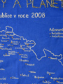
02/2009 / Observatories and Planetariums in the Czech Republic in 2008 / Šárka Růžičková / 2009 / textile-dyes , textile, beat
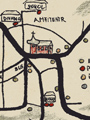
03/2009 / Where for next beer? in Červený Kostelec / Marek Fiala / 2009 / pastel, felt-tip, coaster, Idea: map of placement of beer makes in pubs
04/2009 / Canoeing on the Ploučnice River / Kateřina ŠEDIVÁ / 2009 / drawing ink, wooden paddle

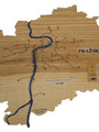
Description: My hobby is whitewater slalom. In depence on it (that is why) I decided to create a creative map about an old wooden kayak paddle. I found a broken canoe paddle on our shipyard, so I had to satisfy with it. I decided to map a canoe clubs on the Ploučnice river, because I am from Česká Lípa and I have been training there from childhood. I decided to use drawing ink, because on burnish wood of paddle is the best solution. There was a problem with a free place, when I tried to press in all map’s cmoponents on this only paddle blade and on the rest cca 20 cm of shaft. Finally also this obstruction was successfully solved. I didn’t have enough space on the paddle so I had to generalize a piece of some left inflows. The drawing I did with thin brush and description with a pen. I do not recommend drawing with brushes for impatient people. I had to work very carefully and be careful, because I did not want to bring out painted water flow, which I did in that moment. Thank’s to it I managed to show a legend for sinhle clubs and wrote proper title.
05/2009 / Map of Středočeský kraj / Renáta Suchá / 2009 / drow, stick, burn, carpet, paper

Description: I devised this map connected with laying down of the carpet which remained a lot and because the carpet liquidation isn’t so easy, I decided to use a carpet otherwise. On the back side of a carpet I drew the square net and one square measure 4x4 cm. Then I drew the outline of the Středočeský kraj with help of the printed map then I drew rivers and towns. Everithing I drew on the back side of a carpet it means conversly. The outline of a map I cut and burned to a carpet doesn’t frey. Then I buirned symbols of towns with help of the white-hot nail (everything I marked by pin). Then I drew rivers by felt-tip pen and described them. Then I printed descroptions of towns (someones also whit the characteristic pictures) then I cut and burned them by flame to looks like old and sticked them by glue. The best usage of a carpet is like the gobelin. I don’t know how much time I needed for the finishing of this map. I created it in parts and during two weeks I was finishing a map.
06/2009 / Pirate´s treasure / Anna LANGOVÁ / 2009 / collage, for children and teenagers, bottle, paper

Description: The idea of map „Pirate´s treasure“ set on me hen I was thinking about some game for children. I decided for looking pirate´s treasure on unknown island. I found picture of some island at first and then also pictures of some impediments, because I can´t draw very well. After this, I printed everything and copy outline of the island on new paper. I stick pictures on my island´s outline then. Hen everything was finished, I tried to improve the island with crayons and also draw some aesy pictures. My frond lent me a fighter to I could sear my map. Then I started to look for an empty bottle of rum. This was the biggest problem, because nobody had. Finally, I took hold an empty bottle of claret and insert my map in.
07/2009 / HIV infection in the Czech Republic / Helena Kalfusová / 2009 / syringe, plastic foil

Description: Last week I listened to the radio and I was shocked. The number of HIV positve people in the Czech Republic rised again in this year. The number is really high compared to the last year. In 2008 was tain with HIV more than 1198 people. That is 147 people more than in 2007. The people who are included in this statistics are living people. Also they are the foreigners who have permanent residence in the Czech Republic and are registered in AIDS centers. 1st December is THE WORLD DAY AGAINST THE AIDS. Therefore I decided to map this situation this way. For creative map I needed statistics which I got from the web page: http://www.aids-hiv.cz/udajevCR.html. The number of the HIV positive people is alarming. Mainly in the South Africa. The map was create by the programm GIS. On this map we can find cartogram which is constructed from the dates I found an the webpage I already mentioned. I printed this cartogram on a plastic foil and glued on a syrette which I bought.
08/2009 / AUSTRALIA / Anežka ADAMCOVÁ / 2009 / pen-and-ink drawing combined with aquarelle, paper

Description: My sister is an artist and has many tools for creating any kind of artistic techniques. As I’d seen a pen lying on her desk, an idea of combining pen-and-ink drawing with aquarelle appeared in my mind. Pen-and-ink-drawn maps look rather old, somehow nice. In the aim of an old-looking map I’d also chosen a special paper which is not really white but more like light-yellow. I’d started with pen-drawing, later continued with colouring. To distinguish mountain ranges, deserts, lakes, basins and cities I used both drawing and colouring: to feature ranges I’d drawn little mountain-like peaks and coloured them brown, to feature deserts I’d drawn dots and coloured them umber, etc – more or less according to cartographic customs. To tell the truth, in spite of my expectations I really enjoyed creating this map. Though it is hard to project an idea from a mind on a sheet of paper, finally it happened to be a nice map.
09/2009 / GEOPOLY / Jan TUMAJER / 2009 / idea: board game, paper

Description: Idea of this map was inspired by game Monopoly and its czech equivalent Dostihy a Sazky. In fact, this map is desk game, in which players move around worldmap and in some states they can buy typical comodities. The aim of play is to get all geomoney of your rivals into your hands. For additional info see „RULES“: players throw the cube and they move their figurines in the direction of arrows on starting field; if player steps on the field of some special industry, he can buy it – it means pay defined amount and put his chip on the field; if player steps on the field, that he already owns (there is already his chip on it), he can upgrade it – pay the amount next time and put his second chip on the field; one field can’t be upgraded more than twice (it means, that there can be only three chips on one field); if player steps on the field which belongs to other player, he has to pay some money to owner; the amount depends on the number of chips on the field; for each owners chip you must pay him 50 % of amount, that is written at the bottom of the field (max. 150 %); if someone owns all three countries with related industries (these triplets have the same colour of the frame which sorrounds the fields), he gets 3times more money from other players, which step on them; if there is written some special accident in the field, it effects the player, which steps on that field; last type of field is „Accident“ field...
10/2009 / REGIONS OF THE CZECH REPUBLIC / Vojtěch Dvořák / 2009 / collage, paper and packets from products

Description: When I saw the last works I tried to think out some new and also inspire with last works. The choise of technique was fundamental for me. At the beginning I wanted create something like pop art from Andy Warhol, but in the end I realized that It´s really hard to do. So i decided for collage which is not so difficult and in the other han dis effective. And why I choosed the Regions of the Czech Republic and her characteristics? Each region is known for something good or bad. I wanted to give out something from myself to my art, so the characteristics are alsou assocations. At the beginning I wanted create the region from food, which is originally from them but in the end I choosed the combination of the pictures a packets from food that are typical for them. The reason was the durability. The food change the smell a colour after some time. I tried to do this work with unworldliness and fun. So I made the region Vysočina with salame or the region Olomouc with doctor Hudeček.
11/2009 / The Garden of My Childhood / Kristýna FALÁTKOVÁ / 2009 / drawing, collage, paper

Description: I created a map of our garden as I remember it from my childhood. The map is on plain paper, in A3 format. For drawing I used color pencils, markers and thin black and blue liners. The basic shape and the structure of the garden correspond to reality but I put rather my memories into the parts of the map. I tried to draw some parts (buildings, fences) of the map in 2,5D to look more interesting – so it´s rather a combined view, not a direct view from above. The drawing is completed with printed images and authentic photos. You can find many labels of various games (e.g. „Who can spin around longer“) or specific places (e.g. „The graveyard of animals“) in the map. I must admit that not everything is mapped exactly as it was in real – it´s rather a compromise (many activities wouldn´t fit into the map, it would be difficult to explain/draw them). I tried to create a playful title to evoke books and magazines for children. Finally I had the map copied in color.
12/2009 / ADALAR – land of Daoines / Jan PULEC / 2009 / drawing, fiction and imagination - fantasy, color paper

Description: When I was younger, I was interested in fantasy. I loved the world of the Lord of the Rings, I played Dragon´s den and participated LARPs. It was absolutely clear how my creative map will look like. When I played Dragon´s den, I came into contact with a lot of fantasy maps. And when I was sixteen, I decided to draw my own fantasy map. The result was in A0 size., but it wasn´t use in a game. Now in a making of creative maps I tried to draw my second map. It isn´t so large. However it is more esthetic, more sophisticated and I tried to do any of previous mistakes. This shown land is totaly fictional and it doesn´t respond to any other mainland in our world. I used a substitute of parchment as a background. At the beginning I was thinking to make the map on computer, but I refuse this idea. At first I draw all curves and objects by pencil and then I traced it by centropen. The hardest step was drawing the north arrow and decorative ship. I am not a good draftsman so I was very surprised with the result.
13/2009 / The breweries of Pardubice’s region / Lukáš ŠMÍDEK / 2009 / drawing, collage, paper, glued beer mats

Description: I was thiknking for a long time, what shall I do and what kind of creative map shall I choose. At the first time I needed to make map of Chrudim like a college, because I live there and it´s very nice historical town. I tryed to prepare some bases in AutoCAD but I found it very difficult topic for me because of my absolute inability to create. So I asked my Dad to help me to find something what isn´t too difficult to make for me and it´s interesting too. My Dad advised me to make map of breweries in the Czech Republic. It was a good idea but how to make it? I wanted to use a lot of beer mats a and stick it on paper but the beer mats are too large to use them in map of whole Czech Republic. So I have chosen only a part of the Czech Republic – The region of Pardubice. At the first time I have drawn the region with basic topografical items like capital cities of particular countries, main roads, railways and rivers. Next time I have stuck the beer mats on paper and made the „beer isolines“. I have to say that the map what have I done isn´t so horrible as I expected at the first time.
14/2009 / Moluccas – Spice Islands / Martina JÍLKOVÁ / 2009 / collage, textile, spices

Description: My first idea was to make a collage, the second one was to use an unconventional material, and eventually I wanted to unite the look and the theme of the map in a witty way. So, why not to make Spice Islands of spice? I remembered the name of Moluccas which comes from the era of colonialism – Spice Islands, and everything was clear. The shape of the map – an opened box – resulted from the fact that it wasn’t possible to spread all the planned parts on the A3 format. The box seemed to be perfect for the layout and it even adds to unusual charakter of map. So, first I dyed an old cloth blue and put it around all parts of the box, it represents a sea. The rest is made of sweet basil, rose-apple and bay leaf. I put the islands (made of sweet basil), north arrow and lettering in the main area (the bottom). Islands continue even on the side of the box, this way I wanted to make light optical effect. The title „Ostrovy koření (Spice Islands)“ on the next two sides and a north arrow are set up from the bay leaf, it creates such an impressive font. And the scale bar may not be missing on the fourth side, it was the best to make it of rose-apple. Its origin is just on Moluccas, so it was necessary to put it in the map. In the end the complete map of Spice Islands is ready for everybody to watch, touch and even smell it.
15/2009 / Doubraken (Doubravka) / Pavel UTLER / 2009 / drawing - marker, coloured pencils,

Description: My idea of creating the map was closely related with old maps of our territory. I always admired maps, specifically maps of Stable land in Bohemia incurred during 1826 – 1843. I like drawing, that’s my great hobby and so I tried to create such a map and draw it myself. I selected the area, which is displayed on the map, because, that’s part of Pilsen where I live. It isn’t a current and precise plotting of individual objects, but that’s a reconstruction the state in the 19 century. I have chosen technique drawing a thin black marker, accompanied by colored pencils. Description of each parcel was made with a thin red marker. The old maps include natural materials, so I have chosen a woody material A4 size paper, which is for this project, in my opinion, very useful. Color processing of individual buildings is similar to the above maps, these brick residential buildings are colored dark pink and farm buildings are yellow. The map contains all the basic compositional elements (legend, title, scale, imprint, map field) and is supplemented by a rudder. I seared edges of the paper and I slightly crumpled the map, to evoke the final look of the old map.
16/2009 / World of press reports and information 26th November 2009 - conundrum / Adam EMMER / 2009 / assemblage, polystyrene/newspaper

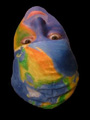
Description: At first glance, some may have questioned whether if it was still a map. The following lines are therefore to try to justify and properly substantiate my belief that one. I wanted some way to point out a number of reports and information from the most diverse parts od the world with whom we are in contact every day and face that geographical distance places today in the transmission of information plays practically no role. The aim was the depiction of the current information world of globalization and the absolute consistency of its parts. For example a newspaper, with a kind of a matter of course for us, every day brings a few hours old news about what is happening to the remotest places of our planet. As a theme for my map, I chose the world infotmation and reports. It is not a view of specific areas, but display abstract world. World that each of us perceives subjectively and therefore also different. Partially thhis map is a mental map, partially fictitious map. Orthodox cartographer might argue that this is not kosher, but it is the creative map. As the art technology for my map, I chose assemblage. Motive a conundrum I used to demonstrate the principle of a well-functioning, well adjusted information mechanism, which can not operate at the possible absence of some of its parts, since all fit together and have their irreplaceable role (above absolute consistency). And also because I love puzzles. And in terms of imagery, the work consisted of two parts. The first few hours I raged with polystyrene cutting, using blade on the iron and the other a few hours I was furious at the cutting and gluing of articles from newspapers (Právo 26.11.2009) and their parts.
17/2009 / OVERFLOWED SECTORS OF UNDERGROUND, flood 2002 / Pavel MOŠNA / 2009 / collage, paper, plastic material, water

Description: The idea of creating this map was borne, when I saw the mark of water level from flood in 2002 on escalator in station Karlovo náměstí, while I left Albertov. Although there was many reports about this overflowed in media, I realized that I almost can’t imagin its range. Fortunately there is a lot of information about this issue and they are available. Bigger problem was how realize this map to everybody could fast and easily imagine, which sectors were overflowed and compare each route of underground with the others. Indeed clasical schematic 2D map had been already created, but it isn’t very attractive in my opinion. I want make something palpable, so I decided to create simple and telling 3D map. To symbolized the overflowed sectors I decided to use water- element which evoke this event. For better imagination how was each route of underground overflowed and for better possibilities of comparing has water same color as the single route.
18/2009 / WOOD-PROCESSING INDUSTRY / Vojtěch TRYZNA / 2009 / woodcarving, wood

Description: I like working with wood, so I decided to create my creative map of this material. The problem was just what and how to view. It occurred to me that what shows should be associated with wood, so I chose the wood-processing industry. The basis was Atlas České republiky Kartografie Praha from 2005. I found the plywood corresponding dimensions and retraced from paper borders the Czech Republic. I fastened plywood in a vise and fastened saw slice in the arc handsaw (for the less skilled people, it is better to get more slices). Then I recalled my school years in primary school when I learned to carve in lessons, and as it were: "What you learn in youth, in old age as you find." Carved the outline and then had turn Electronic transformed soldering iron type ETP III 220V, produced by the kooperative society KYJOVAN Kyjov, under the direction of superiors authority ČSVD PRAGUE, original price 125 Czechoslovak crowns, with which I fired the names and positions of cities with the wood-processing-industry.
19/2009 / Orbis Salamandraru / Anna Kodríková / 2009 / distemper, paper

Description: I found a picture of interchanged continents and oceans in the internet and it seemed to me it is fitting into today’s hectic world and I started to build on it. I painted tectonic plates as countries and undersea mountains on a new land. I used inverse visualisation of real mountains when I painted seas depth. Forests were placed by chance. New names of created phenomena relate with real geographical phenomena. From that moment my map started to look as fantasy map. I remembered famous Czech author Karel Čapek and his piece War with the Newts and this topic in this book fit a lot with my map. I painted newt as a north arrow and his evolution from beginning up to now below the map. (Painted animals really existed, but one of them is not zoologically from his evolutionary branch). Paths lead from one ocean to another because according to book War with the Newts, Salamanders prefer water to land. I stylized my map a little bit to historical map. Geographical phenomena are not painted right according to cartography, but I felt it is more a painting than a map.
20/2009 / NBA / Matúš KEPIČ / 2009 / paper, skewer

Description: Creative idea to create a map with the NBA theme, was my first because sport is my big hobby. A mere NBA before television with chips is my favorite activity. Something to map´s creation. The problem was the technique by which I was create a map. Initial idea was that instead of pasteboard , I use polystyrene. Unfortunately, even me, from the mysterious reasons, I could not get polystyrene and so I finally chose paper for drawing. In a scale of 1:20 000 000 I displayed the U.S. map, complete composition of map and then started the worst part of creating this map. Cutting characteristics of basketball clubs associated with sticking to skewer and then prick it to the map to the right place. The work requires tremendous patience, especially for people who do not love scissors. But with the result I am satisfied. I have never much influence of creating. I would like to recommended for potential future candidates, for making similar maps, at first choose polysteren and not paper for drawing, also great patience, sharp scissors and a good cup of coffee. The result of work always pleases.
21/2009 / GOLF LINKS / Ilona SVAČINOVÁ / 2009 / modellink, modurit (modeling material), colour paper

Description: My first idea was astronomical map. My sister inspire me other idea. She projected building of golf club. So, I decided to create golf links map. Sister gave me all base data (maps, photos ). Next problem was construct material. Finally was chosen modurit. This material is little analogous like ceramic material. But it has different color, different properties and different working. It was difficult find to shop where modurit is buyable. There is possibility to buy more forms of modurit. Exists air-drying modurit or hot modurit. I bought air-drying form. There wasn´t manual so I didn´t know how long to dry modurit and how much water to add to modurit. Work with this material was one big experiment. At first was made beckground in A4 format. Than I made green and fairway. At last I made car park and golf club´s building. It got dry in one week. Than I colored it by chalk. Unfortunately beckground crazed next week. So I put the map on black decorative paper and wrote title. I gained an experience: Better classic than unknown material. I had a lot of problems and worries with modurit.
22/2009 / Puzzle of Germany / Tereza HÖNIGOVÁ / 2009 / tempera, paper

Description: At first I wanted to make something both creative and functional because I prefer these things. When I was a scout girl, I create many different maps and plans for our games. So, it took me some time to think up something new. Suddenly I remembered puzzle! Puzzle improves child´s thinking and imaging. It could be good teaching aid, couldn´t it? So, at first I printed a map of Germany. It clear, that I couldn´t draw it without pattern. Then I coloured each of state. It was said in cartography, we should use only four colours. That´s why I used yellow, red, green and blue colour. I translated all names of german states into Czech because I wanted to have only Czech in map. Then I added title, legend, north arrow, scale text etc. At least I cut my map in 70 pieces and created a box to my puzzle. Enjoy it!
23/2009 / Czech cows say: “Drink milk from as !“ / Pavlína KUBŮ / 2009 / collage on a box, paper, milk box

Description: Creative map. Super I said. I like drawing and to it related activities, But to think some topic it was worse. I was thinking long time how to do it, I had some proposals but came from them. The main request on the creative map for me was processing something what man uses every day and he thinks that it is normal. I wanted to give to my creative map a joke and also keep objectivity. And then it thought me – when I was drinking milk – i will do ,,map“ which will be about milk. I liked this idea and finally I did it as a wish from Czech cows to buy their excellent milk. No foreign milk. First I did a cartogram in prograrmme GIS about Number of cows kept in region of the Czech Republic for milk. Then I printed some pictures of cows and put these pictures on milk box. Production took me about 3 hours, I liked this work. I hope you will enjoy.
24/2009 / Agriculture in the selected states of the USA in 2007 / Kateřina FRAINDOVÁ / 2009 / cutting, wood

Description: My one and half year old brother inspired me, because he’s in the age when skip-frogs are everything for him. Wood looked optimal for me, because it’s good to work with along with stand together ( even if it twirl a little bit…). So I took old plywood, coping saw and after Idraw in borders of the states of the USA ( I draw in from the atlas with the aid transparent paper and pencil), I started to cut. Cutting were easy, but when I pucker, the sheets cracked. I wondered about the map theme and I chose agriculture, because it’s between natural and social them, same as made plywood. At first I draw areas with land use and colored with crayons. After it I printed title, legend, printer’s mark, ratio scale, sources, north arrow (since the last term I know, that my handwriting is bad and I have to use pc) and with transparent paper and carbon paper I copy it in the map and contoured it with black fix. At the end I screw it together and it was finished.
25/2009 / Albertov on my eyes / Petra Kolešová / 2009 / crayons, paper
Description: The inspiration for creating my creative map came on my mind after I saw the map of our auditorium "Velká geologická" from past years. I wanted to create something funny and also something that is known to my colleagues. So I decided to map the Albertov, but in non-general way. I wanted to do it in way that I know it so I renamed all the significant colleges and I also added my favourite place which I ofte visit. As a result, from my map you can see whereabout I am moving around (canteen, pub otr ram station). I also wanted to show my relationship to some of the places (if there is some). There are also places, which I haven´t visited yet, marked as "unknown territory". In legend I wanted to show my favourite places. I like going to school sometimes, sometimes not, there are some building I do not have a relationship with tehm. It was quite an interesting idea, but for me, as a person without fantasy and without the balanced feeling for colours it wasn´t probably the best one...
26/2009 / Galapágos Islands / Petra BABČANÍKOVÁ / 2009 / modellink, collage, map for children, carton, colour papers, pictures
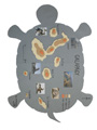
Description: I had been thinking a long time about the theme for my creative map. Then I chose a map for children because I study teaching of geography. On my map there are the Galapagos Islands in the Pacific ocean. I think that the main characteristics of Galapagos are typical animals, especially Galapagos giant tortoise. Therefore shape of my paper is a tortoise, which represents an ocean. I used a method of colour hypsometry with colours of yellow, brown and red. I made a plastic model of the islands from a carton and colour papers. It´s separated into three intervals of elevation above the sea-level (0–500, 500–1200, 1200–1660 m a.s.l.). The Islands are of volcanic origin. Onto the paper I also put pictures of other typical animals - for instance giant tortoise, penguin, iguana, seal and cormorant. Later I titled the map, put the scale, legend and my name in. Hopefully my map would be very educational and simple for children and so they would remember animals, shape and place of the Galapagos Islands.
27/2009 / Erotic City in Prague / Zsolt PARAJ / 2009 / mosaic, paper

Description: Have you ever got a feeling, when you walk in Prague, that you can see everywhere erotic shops, for example Erotic City? Yes, I had this feeling! This is the main reason to create a map like this. To make a creative map was a good chance to put some unusual part in it. The main idea was built on mosaics. Firstly I wanted to do a map with a girl in the background and split it to mosaics. But the map is not functionally perfect, when you can not see streets, main roads, parts of the city etc. That was the reason to split into mosaics only the girl in background. I used for it freeware program Andrea Mosaic. This is a very simple program, where you can set number of pictures in mosaic, resolution, quality etc. I splat my picture to 10,000 little mosaics. Mosaics are erotic pictures, too. I spent about 6 hours to choose the best picture (girl) to background. Then I downloaded parts of the city from mapy.cz, connected them and cut it to size, that every Erotic City shop in Prague was on it. I found locations and shops marked with little magenta pots. U putted the crest of Prague and the crest of Erotic City on it. The last idea was to use unusual letters in title. Yes, those are erotic, too. Finally I printed it and now you can see my first creative map. Enjoy it!
28/2009 / Reserved areas of the Czech Republic / Roman Hošek / 2009 / burning, wood

Description: I remembered my grandfather´s burn in machine and it sounded as a good idea to me to create my map on a wooden board with it. I chose natural theme of map, because it fit to wooden basis – I burnt in National parks and reserved areas of the Czech Republic. At first I found suitable board, sawed it and surfaced it to a final shape. After that I created a map of National parks and Reserved areas in Arcmap to have a model with right parameters. I also draw some shapes with pencil before burning in. I labelled every national park and reserved area. At first I also wanted to burn in rivers, but I realized that it is impossible because I could burn in only one width of a line. In the end I varnished my map twice and finally it was done.
29/2009 / Distribution of the bulbs in Kolin / Michal HORÁČEK / 2009 / abstraction, felt-tip, varnish, bulb

Description: On Friday afternoon, I finally decided to start working on my creative map. I considered about experiences from my childhood. I had a plan to interpret it on the T-shirt, which caused like a witness of one day of my childhood. I thought to imprint it with football riddled in mud and I want to rip it up (accident, which happened during the climbing over the fence during the big theft of delicious pears at our neighbors garden). But there were a problem with realization. I couldn’t imagine the map with this description. Because of this obstruction, I gave up this idea and I hoped to get the idea unreasonably. And that really happened. I woke up at 3. a.m. and I had the vision how to do it. It was a map of Kolin drawn on bulb, which performed the projector. I started to search haphazardly and I looked for bulbs. It was unsuccessful. Thanks to God, that we had a Tesco store which worked nonstop. I ran to that shop and I bought the bulb as big as possible, because I wanted to paint on it. When I came home, with the pleasant feeling of good idea, I fell asleep immediately. I sought for data next day. Seriously, there was nothing I needed on Internet. So I took the bike and I rode around the whole Kolin to every single electroshop to look up where to buy the bulbs and where could I buy last units of 100W bulbs. After my ride (whoever could say before, that I rode a bike on 5.december?) I reached home and I started to draw my map of Kolin on the bulb. I found out, only felt-tip couldn’t be erased simply by hand. When I finished, I screwed it in and I turned the lights on. Nothing. I didn’t know why, but the overall effect was poor. I consulted it with my friends and I got a tip of Vojta, to trace it with nail-varnish. I didn’t use this product, so I went to my friends to lend one. I had a black one and I traced my creation. I have to admit, that the effect is still not according my expectation, but it’s much better now.
30/2009 / Counties of the Czech Republic / Petra VLČKOVÁ / 2009 / embroidery, paper, colored cotton
Description: At first, I had no idea how to create my creative map. I had considered it intensively for long time, but still nothing. So then I tried to fall asleep and finally, out of the blue, there were unexpected idea about needlecraft. I have to admit, I was stimulated by my mother, she had dealt with needlecraft. At first, I had to find out, If I had a necessary material. We had run out everything I needed. So I walked into the town and I bought quarter size A3, tracing paper and required colored cotton. I chose the colors of the cotton to fit each other. I was successful in choosing. Then I could happily turned on my hard, but challenging work. I started with tracing paper. I put it on school atlas and I copy the shape of the Czech Republic. After that, I redrew it from tracing paper to quarter. When the republic was on quarter, I started to sew around her shapes. I chose classical violet color. Boundaries were sewed with double colored cotton and every district had got his own color. At the end, I wrote a title, colophon, legend, scale and it was done.
31/2009 / AFRICA, The Political Map of the Puzzle / Karin KOŠÍKOVÁ / 2009 / crayons, paper, cardboard
Description: I was inspired to this idea by my younger sister, who likes composing puzzle and by a book „The Atlas of the Great World“, which is a good instrument how to learn children about the basics of all continents. It´s a play. This map is map is handmade. At first I scaled a Picture of Afrika u pand redrew it to the quarter bat, size of 66×59 cm. Then I insert Legend, Scale bar, Scale text, masthead and North Arrow. All these things I coloured with crayons and I drew the important objects to some countries, for example an elephant constitutes National Parks in central Afrika or an oil tower, which represents the industry of Libya. All the components I descripted. To the karton of the same size I sticked a double-sided sticky tape and then I laid the quarter bat on. Finally I shred this map and my puzzle was finished. Whole manufacturing lasted all the weekend, that´s approximately 7hours. The biggest problem I had, was to get a cardboard in size I need, than to stisk the quarter bat on corectly and also to shred all the stripes – cardboard, double-sided sticky tape and quarter bat.
32/2009 / Procession of Lampions in the Czech Republic on November 11th 2009 / Alena PROCHÁZKOVÁ / 2009 / pc graphics, paper

Description: There was an experience, I was walking home from a grocery when a procession of people holding lampions in their hands crossed my way. I was really surprised to see so many people with lampions, I have never seen it before, so I was just staring on them. I didn´t know what was going on there. Later I´ve been told that the procession is organised every year by means of schools. In addition this year it was connected with celebration of anniversary of democracy in CZ. In this moment a realized I could make a map, which would show this hypotetical situation in the Czech Republic from top view. Of course there are two important conditions that everyhing else should be in the dark and the light in lampions should be very strong to be visiblefrom a far.
33/2009 / EUROPEAN COUNTRIES – Political Map / Matěj SOUKUP / 2009 / pc graphics, geometric abstraction, paper

Description: From the various artistic styles I found geometrical abstraction the easisest and one of the most appropriate to create a map. I stood before a question of how to abstract. At first I wanted to abstract all states in the same shape of different dimensions (e.g. rectagle), but in terms of maintaining adjacency it seemed unreal. Moreover, I wanted to have the original theme, but this would be only the geometrically abstracted map of states. So why not use the shape as the information carrier? I decided to use the number of vertices of the polygon. I also wanted do visualize some interesting theme. When you do a crazy map, it should also have a crazy theme. The initial idea was the number of towers in residences of the Heads of the State. On closer examination I found that most states would be an ellipse, so I refrained from it and choose a shade less original topic - the number of Heads of Government from 1995 to present. Once the map of states is called the political map I decided to add to it a political issue. The frequent changing of Government, the more vertices, hence the picture is similar to state reality. Unfortunately many states become quite difficult viewable (those with three or less of the Heads of Government) and I was forced to use various overlaps and gaps to come closer to reality. To view the states where the value was less then 3 I had to use a curve to got a area. Therefore I do not recommend the further practical use of this method. I know the four color theroem but I decided to display states in five colors because I wanted every state to have a color that is included in its flag.
34/2009 / The Journey around the World / Šárka TÁBORSKÁ / 2009 / toilet paper
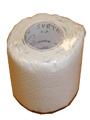
Description: I exactly remember the moment when I though a map of toilet paper. It was not surprisingly associated with the need to visit the toilet. It came suddenly, when we were discussing ideas for a creative map. Now I had a clear idea how the final map will look like. It will be a Journey around the World! So I bought the appropriate supplies - gel pen, not to double-sided map, children stamp, glue, and especially toilet paper. The original idea to draw whole roll of toilet paper with the equator area, I quickly dismissed. First, the majority of the role fell to the sea and oceans, second, I have to draw 200 fragments with territory of 40 000 km, it is 200 km in each fragment, which is 1.8° longitude. And because I did not have the detailed maps, the result is „porter“ of 120 fragments and shifted to 40 ° north. The creation was not difficult and took about 4 hours. And one added bonus - with the help of gel pens I´ve done from the non perfume toIlet paper the perfume one. BE USEFUL!
35/2009 / France metropolitaine / Vojtěch VALTR / 2009 / collage,
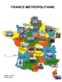
Description: During creation this map I changed several times subject of map. At the first time, I wanted in map someway figure production of cheese in France according regions. For the sake of data I decided create a map of French gourmand specialties for all regions. But this idea was not the final and I created map of France, and into the map I placed picture, which all of them represent represented one region. In AutoCAD I made map of regions and into this map I glued pictures . Every picture I glued into the region by one side. On the other side from the back I glued description of that picture to prevention misinterpretation. Worst part of this work was glueing titles of the pictures from the back. This work took main part of the time which I made a map, nevertheless with little patience and accuracy this could be done.
36/2009 / New Earth / Jonáš ČASTULÍK / 2009 / pc graphic in CorelDRAW, paper
Description: If I didn´t want to do creative map so much creative, I was thinking very long time how to combine creativity with using my abilities achieved by my studies. After long thinking and trying to realize this idea in GIS program, i focused on program Corel Draw, which I used in freshman class for creation maps. Like a pattern, I decided to use a common map and my objective was to creat a map of totally new world. Procedure was simple, i started with choosing the display (Robinsons) and then I draw the continents, islands and peninsulas in Corel. Next step was to write down simply what common maps contain (paralles and meridians) and I dropped down on the most difficuilt part, that I mean making up the fake names. Most of them are twisted names of my friends, who helped me with ideas or anagrams of things which were beside me during my work. (For example, you can look up the names groups, animals and so on). After this difficult task, I printed the map on the formar A3. And there are my results...
37/2009 / Administrative division, waters and altitude / Hana KUCHOVÁ - BREBURDOVÁ / 2009 / painting on glass, colour glass

Description: I chose a map of the Czech Republic, which shows the administrative division of the state, waters and altitude. The map is made of colours for glass. The colours represent altitude and the line represent the administrative division and waters. The map is composed of two parts. The first one is on paper and includes the title of the map, subtitle, legend, scale, rudder, masthead and the map with field waters. The second one is drawn with colours of glass. The map is on a foil. After peeling the map off, it can be used as a decoration in a window or on a painted wood.
38/2009 / Types of floors / Kryštof MARYŠKO / 2009 / collage, wood, carpet, pavement

Description: I chose floor in our family house as a theme of my creative map. Immediately after submission of this project this theme occured me, because my sister is an engineer of building construction and her projects always interested me. So I decited that it would be fine to map floor which I walk so often on. I also submitted that the map could be various with all the materials which are used in the house. A couple of problems appeared at cutting wood which crumbled. A carpet could be only cutted line by line because on the other way welts would fray out. At describing the carpet I had to make the numbers of white paper because a black fix wasn´t visible. In a final trim (there is different list of roof on each side) I tried to make provision for real list of our roof. This project took me not a few time, but I´m satisfied with the result beyond expectation.
39/2009 / Catchment of Ratibořka River / Petra ŠÍPKOVÁ / 2009 / needlework, textil

Description: My first idea for creative map was to bake some gingerbread or cake. Theme would be catchment, but then I realised, that i would not be at home for three weeks, and to bake on a student´s hostel is not so easy as to bake at home. Finally, I decided for needlework. For me it is job, when I can relax and take some other feelings. But, the most horrible was making the title. To stitch the letters in title totally makes me crazy. Later, I realised that this is a creative map, and no one can knows, how it is right, so I stopped being stressed and, suddenly, it was easier for me and I hope it looks good. Last when I stitched, I was a little girl, about 12 years old, and it was some present for my grandmother. Happily, it is a job, which you can´t forget. So I started to stitch a catchment of river Ratibořka. This river I have already drawn in last school year, so I used it as a pattern. Material we had at home, so it was easy to start. I remembered on my child´s years and in three days the map was done. I would recommended this technique for everyone, who likes handworks.
40/2009 / Advent Celebrations, Bohemia in 2009 / Michaela DOLEJŠOVÁ / 2009 / decoration, gingerbread

Description: I love gingerbread and making it since my childhood. That is why I have chosen this material for making creative map. Actually, if you work with gingerbread dought, you can make almost everything; from small cut pieces through Christmas cribs to 3D pieces. Everything is completely edible (including the glaze). The gingerbread is mostly soft immediately after baking, but sometimes few days help (but you have to keep it in a little humid surrounding, otherwise it hardens). The glaze is made of sugar and eggs. You need to practise working with it a little bit, but it is not as difficult as it seems. The hardest point is to make the line straight (which was a little problem for me also). In the end I must say that this way of creating a special map is suitable for everybody who likes cooking or baking.
41/2009 / Water requirement in the Czech Republic in 2008 / Eva ČECHOVÁ / 2009 / ceramic cup

Description: The idea of thermocup came coincidentally. I can´t paint, make things from paper or wood and the same problem I have with baking. For the first time i noticed it in copycentre during waiting in queue, there were also t-shirts and another printable things. I thougt it´s a good idea for Christmas present, but i changed my ming after we get to make a creative map – it´s certainly perfect idea for creative map. Actually, i will not have better. I started to work nearly at the last time. At the first, I went to this copycentre to find out, how much it costs, how long it takes and so on. Finally, I make the map in ArcMap, which was really easy and didn´t take much time. The final map should have size 7×9 centimeteres, so i needed to make the type much bigger, because without this it wouldn’t be readable. I hope, i found good size and fortunately there was no problem with the picture quality, how the shop-assistant told me.
42/2009 / Central Bohemian Region / Stanislav RATAJ / 2009 / paper modelling and sticking, paper

Description: First of all I must admit that I initially had an entirely different picture of my creative map. I was inspired by creations of last year and wanted to take up to some of these gingerbread maps, but due to the unsuitable confectionary equipment and some of my culinary ineptitude, I have rejected this option. Then I was thinking about a combination of my favorite activity (paper castles and palaces modeling) with map creating. On that occasion, I have previously completed my unfinished model of Karlstejn castle. I took the castle as an important cultural symbol representing the Central Bohemia, its map I used as a basis for the actual model of the castle. The map itself shows the most topographical important elements of the region (mountain range, waters, basic transport infrastructure), which is used more for orientation. It is also added to the basic symbols of the region (the symbol and logo). The whole model is thus conceived as a symbolic representation of the region with a portrait of its landmark. Model is created from paper (using glue,cellotape) and computer-generated map (using ArcGIS) is also sticked with paper cardboard.
43/2009 / My right hand / Tomáš BURDYCH / 2009 / aquarelle, paper, felt-tip

Description: Quite soon I had an idea how to do this work. That really was the original and super idea but I forgot whether it is possible to make it. I belive that. I spent about 30CZK (= 1 euro + several cents) before I realized that I wasn´t able to manage it. After this I had to indent a new image. I was a lucky boy because the new idea came soon. I decided to paint my right hand. There were several presumption for work. Firstly I wanted to make something original, secondly I had to observe cartographic rules, also there were the other conditions but not so important. „MY RIGHT HAND“ looked that realize both main conditions mentioned above. And it was reason to start work. I chose aquarelle like a technique, because I had an aquarelle colours at home. (secondly I presumed, it didn´t take such a long time) The reason for yellow hand and blue till purple suroundings was a resemblance with land and sea on the maps. Purple colour I mainly chose, because it is the complementary colour to yellow. This affect should cause that the yellow hand is appeared to be little before its „sea“ surroundings and purple emphasizes all area of my hand. I tried to use colours without black like the impressionistic painters but I didn´t draw the map like them. At the end I have to say, that difficult to me was creating a map legend especially labels. I was forced to use fix pen there. The map legend cause, it doesn´t look so good, but it´s necessary part.
44/2009 / Cantinas UK in Prague / Lucie RATAJOVÁ / 2009 / glass colors, ceramic
Description: I chose theme related to study at university. Each student visits at least once in life time one cantina nearby an area of his uni. I want to sketch placing of cantinas in Prague. Because of lack of space there was not enough room for quality evaluation of cantinas, which could be more beneficial. To design, I used properties: knife and fork, plate, tooth-picks and bread. I copied printed map of Prague on plastic film with window colors. Afterwards I painted it. At my hand I had 5 colours, so the result is very colourful. Acording to my knowledge of cartography it would by useful to use some different colours in order todistinguish clearly among components of map. First there needed to be dry white edge and than I could fill in the rest of space. After the flash time I transfered my picture to the plate. By molten silicon I stuck the names of cantines on the plate. Dried bread was used as a holder for tooth-picks. Chosen technique was easy, not so take time-consuming (the longest period was when I waited for color to dry), but it required patience.
45/2009 / Ptolemy´s map of the northern hemisphere / Dominika VLČKOVÁ / 2009 / paper, wood

Description: For my creative map I chose the shape of a fan. Its skeleton is made of pared tongue depressors, into which I drilled a hole. Inside the hole I put a bolt and fastened it by a nut. Then I had to deside which map field will be the most appropriate to realise. At first, I wanted to make a map of time zones, but then I rejected it. I found the best the familiar form of Ptolemy´s projection, more precisely Ptolemy´s map of the northern hemisphere in the normal position, (φ0 = 30˚ north latitude, Central Meridian 170˚ east longitude), because its shape fits well the design of my fan. For this its projection I used ArcMap – equidistance conic. After I cut out this projection, I divided it into appropriate sections (to ensure correct composition and subsequent gluing), I discovered that there is a problem. This problem was the excess number of the tongue depressors and an improper composition of the fan. I solved this problem by removing one depressor from the frame of my fan, so that the final number of the sections was 6 and their distribution was 36˚. I printed the map once more and glued it on the fan. Finally, I added the title and subtitle, scale and imprint.
46/2009 / Districts of the Czech Republic / Kristýna SOUDKOVÁ / 2009 / collage, dadaism, paper
Description: When I thought about the theme for my creative map, I remembered Tristan Tzara and his manual how to make a Dadaistic poem. “Take a newspaper. Take a pair of scissors. Choose an article as long as you are planning to make your poem. Cut out the article. Then cut out each of the words that make up this article and put them in a bag. Shake it gently. Then take out the scraps one after the other in the order in which they left the bag. Copy conscientiously. The poem will be like you.” I followed the instructions with a few little changes, for example I had a map of the Czech Republic instead of the article. I cut out each cell of the net. These pieces I took one after the other without any order. That was according to the definition of the art style: “This style (Dadaism) is based on the principle of randomness, nonsensicality. It emphasizes absurdity of art like all new avant-gardes styles. It wants to provoke and shock.” So thus I created an absurd Dadaistic map…
47/2009 / MIDDLE-EARTH / Jan STACHURA / 2009 / pc graphics, pastel, paper

Description: I decided for this map because J.R.R. Tolkien´s books belong to my favourite books in general. I want to join modern computer with classic painting crayon method. Conversion of Middle-earth to digital shape wasn´t difficult. Making and placing labels took me the longest time from making a map. Also making some new point sign took me a lot of time. Hill method and colour hypsometry was used for elevation resolution. The book “Atlas of Middle-Earth” written by K.W. Fonstad, who studied cartography and geography, helps me in making composition of map and I also found there some exact names for labels. Now the author of this book teaches at the university in Wisconsin. The last part of making process was using of crayons. I chose them because they are good for making many hues of colors. Just mosaic of many hues and many colors make the map creative. Instead of map window I colored round of map. Darker hues of colors were used for around of map. The map contains all obligatory compositional parts.
48/2009 / The Continents of Southern Hemisphere / Tereza STEKLÁ / 2009 / cribration, silk paper, cardboard
Description: The most significant inspiration to creation this map were earth wiews, which are based on projection. I wanted to illustrate how the world looks like, if we looked at it from space during a projection. I couldn´t symbolize the whole world, because of the cornered shape of the lamp. The choosen continents ale located on the southern hemisphere. I chose the selected according to two aspects. The first is psychological. Most people in our latitude join heat and light with southern hemisphere. The second aspect was the shape of the territory, which had to be elongated along the meridians, or circular. For other shapes there is a big problem with composition of map. Antarctica is not associated with heat, but its shape is better than the shape of the remaining continents. I used Marinov transformation to creation of this four maps. I chose silk paper because of the structure created by backlighting. This paper is not too strong, so it can be treated by needle.
49/2009 / Decision of life on the example of turkish export / Filip ŠANC / 2009 / drawing - pencil, paper

Description: The maps are placed in spectacle glasses. There is a mirroring reality on the right spectacle glass of the angled glasses. On all other spectacle glasses are figured thoughts of people who wear them. On the left glass of the angled glasses there is a path to which end the man must deliver a truck. The man with the round glasses is the chief of the man with the angled glasses. On the right glass of the roung glasses there is an idea of Turkish foreign trade to Bulgaria in the year 2009 shown. On the left glass there is outlook for the year 2010. The man expects expansion of trade to Romania, but mostly to France and Italy. These two man are being watched by customs officer, who is mirrored on the right glass of the angled glasses. The customs officer feels that the men have some drugs in the suitcase. So he is thinking: should he capture them or should he be compounded and earn some money. The maps show business travel (the man with the angled glasses), the Turkish foreign trade (the man with the round glasses), but also possible life choice (the customs officer).
50/2009 / The republic of experience / Kateřina RAKOVÁ / 2009 / collage, paper

Description: I was inspired by pictures which are consist of small photos and make a fine mosaic. Regrettably my map doesn´t make any picture – impossible and suicide! My main plan was to cover the whole Czech rebublic by the photos primary by from my collection then I had to seek on the internet. In the pictures (photos) there are castles, natural skenery, symbols or my own experience. Together with photos I printed a foundational map, where I sticked the photos step by step. I chose a fixed width of photo, slaughterous 0,8 cm, and I sticked to create a row. Some places had many interesting place and blocked the others so there are some problems f.e. with neighbourhood. The map is simultaneously a mental map due to individual selection. It was very toilsome. Placement of photos was the worst. Time of making this task it was about 12 hours. Very positive thing is that I found many wonderful places for my next holiday.
51/2009 / Africa – Blind political map / Tereza Šmejkalová / 2009 / glass painting, glass plate, windows colours (peelable)

Description: I couldn´t come up with decent idea of how the map should look like and which technique I should use for very long time. Than I found some pealable windows pictures, I made long ago and so I decided to do my map in the same style. Originaly I though, I would create one of azimuthal projections or some interesting compromise projection, in the end I found out that the shapes of the continents, as Europe for example, woluld be very difficult to draw in this scale and with color applied from tube. That is why I used the least dissected continent Africa. Into the continent I outlined countries. I didn´t place any labels, because it was imposible to to place them into small countries as Lesotho. I tried to keep cartographic rule of maximaly four colours in political map, and I succeded, although the used colours are bit too violent. But with regard to the creative aspect of the map I don´t see it as a negative. Only thing I realy don´t like about my map is the printer´s mark which I wrote with permanent marker.
52/2009 / Soccer France / Daniel ZUB / 2009 / pc graphics, paper
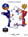
Description: Out of the many ideas for a creative map, I ultimately decided to create Soccer France, using logos of soccer teams of French 1st and 2nd league, because I´m a sports fan and I especially like soccer. French league belongs among the TOP leagues of Europe, maybe even of the whole world. What´s more, the team I have rooted for since I was little, Olympique de Marseille, is a part of it. Using computer program CorelDRAW, I inserted the national flag of France cropped into the shape of the country. I tried to put logos of soccer clubs on this background, respecting the actual locations of the cities which the clubs represent. I represented the prominent clubs by larger symbols, while the less known teams by small logos. I added the national emblem, the logo of the French 1st league and the logo of the French national team. In the end, I added basic elements of composition, so that the whole work looked like a map. This whole task took me about 3 hours.
53/2009 / Africa / Aneta MLČOCHOVÁ / 2009 / watercolour crayons, pencil, water-colour paper
Description: Idea for this map I found at a time that maybe each of us remembers. It is a moment when we see the first this map. Mostly it was a map with lots of colorful images, which are non-violent form of child trying to show where the animal lives, or how we have a varied nationalities in the world! At that time carefree us to do just enough. That moment was perhaps the decisive, if a child falls in love maps, shall be devoted to secrecy, and will ponder over them and merging into your own world of thoughts and start thinking of them. Therefore, I will I got carried away children´s world map, which pointed to something remote and mysterious, and exotic at the same time. Africa, I chose just for the fact that it is the often forgotten. On my map look no proper view of the city in the form of point symbols and names of states. Looking at it only what you really want to see. I took the paper, watercolor crayons and I left purely to work your imagination, which I determine what is given space on the African continent, not least typical expresses my feelings about this country. Unexplored Africa gave rise to rare and extremely diverse African fauna and flora. Any animal, small flower, a grain of sand and endless lake has its mission. And it all together shaping unprecedented natural mosaic of immense beauty. Perhaps people will use their power to save the image, which have been settled for centuries, to our knowledge.
54/2009 / IMPORTANT HEADS OF EUROPE / Alena DUTKOVÁ / 2009 / collage, paper

Description: For my creative map I have chosen collage of "the important heads of Europe", as presidents, kings and queens are. I decided to visualize European Union and countries to Ural as well. But the main thought of the map has during my production changed. At first, I wanted to cut off small pieces of pictuers and them to put them into colored map, which schould have presented also left and right orientation of countries. But as a result of making map clearer, I did only collage of pictures. So I just needed table of each important character of each country and found their picture on the internet websites as google.com or seznam.cz. The most difficult was to find the most "representative" picture for each person. And if you are interested, you can also find the smallest countries of Europe (e.g. Monaco, Andorra and Lichtenstein). I have to admit, that I didn´t all the time follow the cartographic rules, but I enjoyed this creation.
55/2009 / LE TOUR DE BIÈRE / Jiří MATYÁŠ / 2009 / pc graphics, mental map,
Description: This mental map depicts the center of the town Pardubice and a trace leading from the author’s home to several pubs and back. The trace itself is being warped increasingly, to correspond to the actual trajectory, which is influenced by the amount of alcoholic beverages consumed by the person following this trace. The map has no spatial scale, the length of streets is adjusted by the way the author perceives it. A classical spatial scale is substituted by temporal scale, which tells the time needed to pass through a section of the trace (a section is the path between two pubs or a pub and the starting/ending point). The temporal scale also counts with holdups that may possibly occur (and that usually occur). Because trace drawn in the map intersects itself within certain spots, it was necessary to avoid misdirecting the follower. To do this, the author used arrows which show, on most intersections, which direction does the trace continue . On some intersections the arrows have not been used, because warping of the trace is so different in every direction that correct directions are obvious and using arrows would only make the map more difficult to understand.
56/2009 / Prague trams / Antonín KEPRTA / 2009 / collage, veneer, beads, felt, paper
Description: Makeing map of Prague´s public transport was the clear choice for me because I use it every day. And I´m on "my" city proud. Originally it had been a map of the Prague underground, but after some complications, I decided to create map of the trams. Because of my past links to modeling, I wanted to use wood for the map, with whom I have some experience and i like making things of it. Selecting veneer has proved an excellent idea, because let me cut a city border without major problems. The original proposal of wood would be almost unworkable. I had the whole work drawn in the computer so it was mainly about how to redraw it properly. With the lamp, I finally managed to shine through veener and trace tram routes. As far as insights from the map, I would say that only now I realized that although the left bank of the Vltava river has much smaller size, in number of tram lines will be to the right bank close rival. And the number of terminates and depots are fauly balanced. A final lesson (warning) for other makers is that the woodwork is one thing, but the choice of appropriate materials and glue is completely different.
57/2009 / Beer map of Vimperk city / Radek Žďánský / 2009 / paper, beer mat

Description: The idea of creating this map was born at one party with my friends in a pub. I didn’t want to create a map at computer using program Gis or some of the other programs, I wanted to use my fantasy and draw a map how i see reality. Because in Vimperk, there is an incredible number of pubs, I decided to map them. At one of another parties I got some materials needed to create the map and created it. The work was quite long, especially sticking the beer mats together and remembering where each pub is, but the work itself was real fun. The map may not be one of the best by its quality or elaboration, but it definitely catches main groupment of pubs in Vimperk city, so if you decide to, you will surely find a pub, in the map is demonstrated how is each pub superior, and where you can spend your evening nicely.
58/2009 / Regions of the Czech Republic / Lenka SVOBODOVÁ / 2009 / mosaic, glass beads
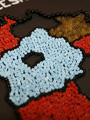
Description: I thought about the theme for my map for a long time. Finally, I found out the book „The Kingdom of Beads“ from my childhood and that inspired me. I remembered my works (pictures, bracelets) and the idea was born. The Czech Republic is a jewel in the heart of Europe – in my rendering rather a semi-precious stone from material reasons. The mosaic of shining areas of beads on the black background differences particular regions, but the sence of the work is mainly the aesthetic impression. The creation was a very laborious one, I would choose another technique next time. I knocked single beads by means of the tweezer and liquid adhesive to the bottom quarto paper into the previously prepared boundaries of regions. I repainted boundaries from the map to a tracing paper and then to a quarto paper. I used a special white felt tip to complete the basic compositional elements. Conclusion: labour intensive, time and financially demanding.
59/2009 / The lookout from the Koukalky rocks / Jakub ŠIROKÝ / 2009 / tempera, impressionism, paper

Description: The art direction I always liked the most is Impressionism. I said then, why not design creative map that style. I googled the internet for famous Impressionist works and tried to remember how such work should look. I asked several friends who have an artistic perception to give me a theme, but no proposal came to me as well and cartographically easily to design than the view of hills in the distance – and nothing but the edge of Železné hory came to mind when speaking about Chotěboř. I have to say that I have also gained the idea of creating a map of nude female body - the impressionism appropriate topic - but I wouldn´t dare it. I used tempera colours on a quarto paper. I tried to leave visible tracks of the tempera colours on canvas as it´s typical for Impressionism. When the "art" was finished, it reminded me a picture postcards with the theme of the town of Chotěboř and I turned the other side of the sheet paper into a postcard.
60/2009 / The biggest and the smallest seats in the Czech Republic / Lukáš MAREK / 2009 / matches, paper
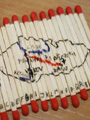
Description: I wanted to create a map that would include not only information but also a game. I decided to do a map that the user will have to first put together to have the information learned. I wanted create a map – puzzle. I had an idea that as the material I could use a box of matches including its contents. Matches I poured from the box on the table selected only the most beatiful and put into cake of clay. I cut small paper outline of the Czech Republic and traced it to fixed matches. Because the map is miniature thus a kind of extreme, I decided that it’s thematic content are two extremes. Two largest (Praha, Brno) and two smallest (Březina, Vlkov) seats in the Czech Republic by population. Each match, I marked a letter from A to X to folding map easier. Then I took out matches from clay and put back into the box. On the box I created title, legend, scale, imprint and a picture with sorting of matches on the map. I must say that the choice of matches as a material for the production of my map was not a good idea. Markers, which I used to drawings blurred on the wood. The descriptions are not well read and map does not look as nice as I had imagined.
61/2009 / Glass industry / Edita TURKOVÁ / 2009 / glass painting, mirror, glass color, permanent marker

Description: When we got the award "to create a creative map," I remembered the third year at high school, when we supposed to make a creative externalize the periodic table of elements. With my friend we painted periodic table by color glass on the mirror. Teacher of chemistry was thrilled to finally see herself as good chemist in the periodic table. I decided the same way also this map, just like it seemed little creative, so I decided to draw maps by mirror style. And I view it in, as represented by the glass industry in the Czech Republic. But once you came to the realization of major complications occurred .... First, how do draw a map when I can not even trace the outline in pencil and all this were reversed? Finally, I cut out the outline of the Czech, which I traced .... while I found that the colors on the glass is not an appropriate tool to draw thin lines, let alone to write captions, so I chose the spirt fix. Rivers, I illustrated by reflection in the mirror. At start write by mirror style was difficult, but after that a while it was almost alone, it´s the same feeling as writing left hand:) If I should now choose how to creatively make a map, I definitely would not choose this. The result did not fare even as I originally intended, even though it was much influenced by the time burdened because I started late.
62/2009 / Prague / Martin ŠTUMPA / 2009 / geometric abstraction, plastic
Description: Long time I thought about the topic. Finally, I took geometric abstraction. Considerably reminds me today´s modern age of computers, where is very easy to create geometric patterns. So I decided to map by the geometric shapes. I chose Prague because the river Vltava here has a unique almost geometric shape. And since the computer to remind me of the square, I decided that my map is a kind of idea of technology for future electronic paper. Which will in future be used as ordinary paper, but it will be a certain computer. As background, I originally wanted to choose a tracing paper, but as the little transparent, I chose plastic cover of the workbook, which is perfect, because the device can be used on almost any book or workbook. And why transparent material? Transparent material I have chosen vision of the future of so-called a expanded reality. Electronic devices transparent, here the map, "display", we can use as a kind of spectacles through which we see the real object, and also a lot of information supplied by the device. For use with cartographic work are already beginning to use today, but the new flexible and transparent materials would have moved this functionality further. To create on the plastic, I chose permanent marker and paperclip fix a hardware button.
63/2009 / Globus / Petra Fialová / 2009 / bodypaint, skin, swimming cap
Description: I got the idea of body painting very soon. I tried think of something original and this technique was not listed on the summary of pieces already made. I had the idea, but I did not know what to paint and where to paint it. My friend suggested me some ideas which I had to refuse because they were very hard to realize, even though they would probably be more successful. I decided to paint the Earth on my head. My friend was upset again when I bought a swimming cap instead of shaving my head clean. To get a better 3D imagination I borrowed a globe. When I had the working place set up, I just needed to buy body paint, temperas (for the case that body paint would not stay on the swimming cap) and paintbrushes. My project had a big disadvantage – you cannot start early, everything has to be done the day (or night) before the deadline. While sleeping the colors could get fuzzy. If I would take of the cap the paint would crack. My project was made in the last moment and the outcome was really hard to predict. If there is going to be some problem, there is no time to remake the project. I just hope that when I am walking to school it is not going to rain.
64/2009 / Diabetes / Jan KORBEL / 2009 / topping figuration, pie

Description: I´ve decide to make creative map by figurating a pie with sugar topping. After baking the pie, and putting the base chocolate topping on it, I figurated the surface of the pie with sugar topping. The theme was chosen according to the used technique. I tis count of diabetes mellitis in chosen European countries. Expressed by Dot density method. Ne dot represents 1 death per 100 000 inhabitants. By creating process , some problems occured, which has to be prevented hen repeating the creation of such a map. I tis neceséry to make as thin topping line as possible. The best way to achieve that is by making the line using plastic bag pierced by a needle. The size of dots is appropriate, though in some countries, the informatik can be distorted because the density of dots i stoo high there. That is because of the size of such states (e.g. Portugal). Another problemwas moving the pie outsider the pan. The baking paper Must be placed under the pie, efore baking, for better manipulation. Data about deaths are representace by those states only, where basal data was available. The source was website of European comission. Enjoy the meal!
65/2009 / Panorama Of Broumovský výběžek / Šárka Zákravská / 2009 / burning, wood
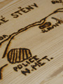
Description: I have chosen the place called U Kaštanu for my work. It is nice and silent place near village called Velké Petrovice, it is ideal place for rest during a trip and in addition with beautiful view of the shire. On the left hand there are sandy rock towns Ostaš and Broumovské stěny, on the right hand we can see Polish hills Bor and with many tales surrounded Hejšovina. What is missing on this place? It is a board, which would describe to the other turist, who are not from this region, what they see around. Therefore I decided, that I make view map of this region. Material, which I chosen for work, is wood and I burnt out drawing to wood by solder. At first I made a lot of photos on this place and I drew rough sketch. Then I redrew everything carefully at home, I engraved it to wood and I started burning out. Unfortunately solder lines are to much thick and it cause, that the names are so large, that there is no place for elevation above sea level.
66/2009 / Map of The One Eye Man’s Secret / Ondřej POP / 2009 / Indian ink, paper

Description: I got the idea of the theme of my map when I was installing a pirate game which caught me with its playability and story. My interest was mainly held by the elaboration of maps for orientating in the game. Therefore I decided to realize this idea. In a special shop I bought a paper which is supposed to look like an old parchment. I started to draw on in fictitious isles, settles and various natural shapes. First, I drew this all by a pencil then retraced by ink. Per sample from an old map I located the direction label and coloured it. In the end I singed the edges of the parchment to make it look authentic. The working on this map was time-consuming, I had to be careful and attentive, especially during the work with ink.In conclusion I can say that I enjoyed creating this map and the outcome of my work is a remarkable imitation of a medieval map.
67/2009 / Regions of the Czech Republic / Veronika MACHÁČKOVÁ / 2009 / mosaic, foodstuffs

Description: When we get a creative map, it crossed my mind that I can anything bake. But I didn´t know what. I thought long time and I thought administrative division of Czech Republic – Regions. The question is, how can I do? Firs I wanted to bake a gingerbread, but finally I did a sponge-cake. Next problem was, how I created contours of Czech republic and Regions. I wanted to use a chocolate glaze, but it isn´t solid. I smeared cottage all sponge-cake and contours were a cottage too – cacao. This map was a poor. In the atlas, there are a colour regions. How can I do it to sponge-cake? I tried to find anything in the shop, but it didn´t turn out well. I thought me a colour coco, but it wasn´t I coloured it. It was hard. Finally it turned out well. I completed scale and title, I wrote a pointer´s mark to the paper, I stuck it to the skewer and and I stabbed to the sponge-cake. Production was hard, but it turned out well. I hope, that the map will be delicious.
68/2009 / Manufacturing of buttons in the Czech republic (2009) / Kristýna LIHANOVÁ / 2009 / needlework, textile, buttons

Description: I was speculated about subjekt, styling and making my creative map for a long time. Perhaps after a week I think up scheme that my map will be inwrought in cloth. A subjekt of map is Nera to method execution, because i tis concerned by topic thematic cartography. I tis manufacturing of buttons in the Czech republic (2009). I was printed outline state, border of countryside and general rivers on a thicker paper. I was cut out this border and drew it on a cloth. I was stitched border by back stitch. Outline of state is black, border of coutryside is orange and rivers are blue. I was found on the internet server village and city where manufacturing of buttons are situated. I was fixed small green button on a position, where is manufatoring situated and wrote name by village or city. I was stitched all of the maps members in the end (title, subtitle, key, scales, north arrow and signature). The final reset is coloured map (A4) which is inwrought on white cloth and framed.
69/2009 / Rum - Where we drank / Tomáš KYSILKA / 2009 / paper, bottle of rum

Description: I got the idea to map places where I and my friends drank rum at the cottage Javořák in Krkonoše during a sport course of the Faculty of science, Charles University. In the course of one of the evening party I noticed that empty bottles of rum and other drinks are starting to fill up the room. This realization made me think of making this map. While completing the map I came across couple of inconveniences. First of all I had to draw boundaries of Czech Republic and counties, which was not easy at all, without the atlas or GIS. Therefore boundaries are not accurate. Another problem was to choose cartographic method to display data in order to have the map graphically filled. Finally I assigned to each of us bottle (of rum) to show in which counties we drank. Furthermore, county where we all drank is highlighted by color. After solving all that I came to new unexpected problem. Unfolding the map sheet inside the bottle. Fortunately after some time the map sheet unfolded on it’s own, but I am worried that this could be problem in the case of future updating too.
70/2009 / AUSTRALIA / Michaela Sladová / 2009 / pc graphic in CorelDRAW, pop art, photopaper

Description: Initially I was thinking about two different themes. First in 3D form and the second in a fancy style. After deliberation cons-and-pros I have chosen the second theme. That means that i will create map in a pop art style.Pop art is a ground-breaking style of 50´s, mainly of young post-war generation.It sounds like a simply and understandable art. Pop art made art comprehensible to the general public.It used kitschness and colour diversity. The most famous pop art painter was Andy Warhole, who used silkscreen process and made art from everyday life. I created map of Australia in Corel, which consists of road map, river map and political map.To make my map “ more pop art“ I choosed violent and unconventional colours. Main colours of map background are yellow, green and blue. If I were creating the map I had to have a lot of patience with creation map details. Each map should have it´s own ratio scale and printer´s mark. Dancing native tribe should Brighton my map. To improve map appearance i printed it on photo paper.
71/2009 / Africa in plasticine / Luboš Mrkva / 2009 / modellink, plasticine

Description: After much thinking, inventing and deprecation designs, seemed to me the best idea with plasticine. What a mistake, since the initial intention to make every state in Africa in a different color, I had to quickly abandon because plasticine did not make what I expected from her, plasticine did not adhere to mat and did not go roll flat. That is why I chose easier vision, I spread over the surface the mixture of the three colors, thereby I created the "mainland" in a shape of Africa. The shape I had delineated on the mat. Continuation should be the sea, a mixture of blue and black colors, unfortunately, this color was also not enough, so the rest is finish of the different pieces, that the result was a integrated shape. Finally, I scraped out in thus formed layer state frontiers, the map name and scale. We can say that the product is different than I had imagined, but creativity can not be denied.
72/2009 / Metro in Prague / Natálie MOHORITOVÁ / 2009 / painting with food dyes, metro desert

Description: Certainly you are familiar with sweete delicacy called Metro desert! The plan of Prague´s metro was going to be illustrated right on the every pieces of metro dessert. But after few tries i was forced to reconsider the procedure and i picturized the stations of metro on the baked flan of the cake. I added particular "coaches" of the metro dessert in the empty spaces of the metro plan. In the Prague´s metro you can easily hit upon train sets which are completely painted with graffiti and that´s why you can find one of my trains tagged from both sides. I was thinking about which tag would fit the best. In the end i chose famous "WHS", which occurs on many spots in Prague. For the painting of the plan as well as the train set i used food dyes specified for cake decoration. Lanes of the metro are made out of yellow, red and green colour. The signs are made in white colour. Train sets are attached to the plan with jam. The whole making of my creative map took me one afternoon and an evening. I had more better ideas on my mind but they were a bit too time consuming or capital-intensive.
73/2009 / Circle around the Czech Republic (board game) / Tomáš HAVRLANT / 2009 / pc graphics, color paper
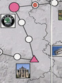
Description: I think I had the first idea to create this kind of map based game because I was keen at playing board games in my youth. Game system is influenced by renowned games like Monopoly or Dostihy a sázky, with the conditions adjusted for Czech republic. The game itself contains 3D model of terrain in the background of map and the map fields which represent the core of game system. There are some categories to which the fileds are divided. One type of fields brings tactital options to the game while another means random luck. The tactical side of game is symbolized by a chance to buy some czech companies which differs by size, but their prices are fictional. Another part of the game is the fields with some of the major cultural dominants of the Czech Republic, which offers the player to get some experience that is later necessary. The regions have different colours and this also brings a bonus for the player in case that he captures the whole region. The map was completely created in ArcGIS.
74/2009 / The map of czech breweries and the number of kinds of beers in counties / Kateřina ŠŤOVÍČKOVÁ / 2009 / collage, paper, beer´s caps

Description: All my family have like a beer, so I used this fact for my creative map. I wanted to make a map of czech breweries and the places, which are standing on signify by corresponding beer´s cap. First I had bought the map of Czech breweries from Cartography of Prague. I was very surprised, how many breweries are in the Czech Republic. It was impossible to collected all of kinds of beer´s caps in the short time. So I tried to collected some caps. My family and also my neighbours helped me. My father, who lives in the south of Czech Republic send me caps from there. My grandmother and grandfather give me their favourite Gambrinus cap and my neighbour give me cap from Kozel beer. Other beers I bought in the shop and then I consumed at home or at the college with my classmates. I also put in the map cartogram of kinds of beer, which we can find in counties of our country. When I collected 28 beer´s caps I stuck them on the map. Most of caps are concentrated near my home, because there I have many occasion to collected them.
75/2009 / When its said... / Barbora ŠACHOVÁ / 2009 / writing, blopens, lampshade

Description: As my creative map I decided to make a globe. The paper lampshade of the brand IKEA, type Regolit seems to me as good beginning. I didn´t expected me to create an exact map, that´s why I used an abstraction. Outlines of continents are made with stencils clipped from globe belts which I blew around with blopens. In this stage it very depends on intensity of blowing and the distance from paper. Also it was very important to create entire stencil to color was not able to get under the future continents. Into this marked continents .I inscribe a words by the clue „the first thing what I occure when its said ..(place)..“ There are inhabitants, animals, plants or typical things and so. I try to not use local describtion anyway for some places its so typica that its appear in the map. I realized few small and one little bit crucial embarassments. Due to relative nonaviabilityof the material its not possiblle to repair. In case of interest or lot manufacture is counted with removing of this defects. Just as the description is typical for the places, is for the author typical to turn world up side down.
76/2009 / The Diploma Journey / Lukáš MERTA / 2009 / pastel, imagination, paper

Description: I began to think about my creative map quite late (I’m a little bit irresponsible student, but I’m still a pretty good one). It was a nice Saturday’s morning a I really began to think. I said to myself my idea need to be really original. And then I got a great idea about our briliant university and suddenly I knew my creation had to mention that. Then it went one easy step by another one. I saw a plains of grass, great mountain masiffes, lakes sparkling in the moonlight. And in the middle of all that there was only one poor student walking ahead to get his dream real – to get the diploma. There are some obstacles that need to be passed. And these are named by our university teachers. It’s because it’s them who make our students’ lives harder. Instead of this I named right one of obstacles by my really good friend (I won’t tell you his name) because of his unpleasant behaviour. What about a used material and technique? „No big deal“ I told myself so I created it by using A4 paper, a few crayons and good quality india-rubber. And I drew it by a view I saw in my mind. After it was finally done I wasn’t so satisfied I hoped to be, but it was still pretty cool.
77/2009 / The main agriculture areas in the Czech republic / Klára Krbcová / 2009 / silk painting, silk
Description: I chose the silk painting, because I thing, that it is not the regular idea. The paint and writing with the gutta is very difficult for the punctuality, so the map isn ´t regularly aligned, the writ hasn´t the same font and it´s not possible to write the small letters (the text would melt). The theme I chose according the difficulty of the writing and painting, so I chose the agriculture regions. At first I bought the silk white zhasl and the blue and black gutta.Before the drawing the silk must be strachem on the speciál construction. With the blue one I paint the main revers and with the black one the others. In agreement with the atlas I chose the main agriculture areas and I think out the sign for each raw materiál. I couldn´t drawned many rough, because the colours would merge together. Than the silk must become dry about 3 hours. Than I used the acryl colour, because it fixed the colours. The whole map I filled up with the green colour, because the paint would be more interesting. The silk became dry and finaly I iron out it over the peace of matter.
78/2009 / Pizza of the Czech Republic / Radek TOMÁŠEK / 2009 / baking, pizza, groceries

Description: I was thinking over the subject of my creative map for quite a long time, when this idea suddenly came to my mind. I have never been fond of visual art but on the other side, I really like the culinary art. That is, actually, the reason why I chose pizza, which is one of my favorites. However, to have somebody eat it, the pasta has to be edible, and therefore I asked one my friend who works at a pizza factory. I printed a map of the Czech Republic with outlines of borders of each county on a tracing paper, so that later on I could put there the pasta itself. Surprisingly, I put there the correct amount of it and even put it into the desirable shape. While looking through the paper, I allocated different materials to each of the counties. My friend even let me bake my pizza in a special pizza oven, so I hope this pizza will be a kind of a masterpiece, despite the small gap in dough. I have to admit, that this time I really enjoyed creating of a map, although to be honest it was mainly due to the fact that the first two trials came to nothing and it was necessary to consume what was left.
79/2009 / New York - Manhattan / Luboš Fendrych / 2009 / collage, pop art, paper

Description: I must confess the fact that I had somewhat different and creativly ideas how to make creativ map. Unfortunately, my work in software GoogleEarth happend for me very treacherous. That´s why I used GoogleEarth only for view to Manhattan from on high 647 meteres. After that I ousted of colours and puted layer to the software in which I connected another layer – it was compendious, but transparent map part of Manhattan. In the Internet I searched out all of the parts of Manhattan (every source has little bit different partition). After that I printed small maps and sticked down them disarranged around big map in a center of paper A3. Disarranged is purposely in order to persons must occupy by orientation and thereby better to remember separate parts of Manhattan. In the end I added a few Picture which are define Manhattan and partly all New York. I´m not pretty sure if the map call collage or pop – art. However I tried to make interesting map which can be used for placard or partly like or orientation map.
80/2009 / Theaters in the Heart of Prague / Veronika MACKOVÁ / 2009 / painting with aniline colours, abstraction, paper

Description: I’m home alone. Sitting at the computer, listening to the music I decide to open MSPaint a begin to draw. I don’t even think about it. Colour by colour, shape by shape, move by move I’m creating something. Ups, I just made a little mistake. Never mind. Ups, now I made a big mistake. Deleted completely. I’m thinking what all I need to handle shortly. What about my creative map? What if I made it a little bit more abstractly? And what if I made it just like a MSPaint painting, I‘ve just made? There are some lines, some points = they could be streets and spots of a phenomenon. These days I live in Prague, so I chose this City for my map field. Specifically its centre. .... How I’m gonna make it? Using computer? No, absolutely not, all my other maps are made by PC. It’ll be a handjob! I’ve got some papers in many various sizes to use (all in my room). A4... too small. A2... too big. A3, it’ll be OK. It won’t be overcrowded or too much empty. I love painting, even though I have actually never been devoted to it. Aniline colours. I bought them a month ago as I needed them to create a cubist painting which is now over my bed. I’ll use them. I could not find a map in suitable map scale, according to which I could do it. So I took a paper, put it on the notebook screen and draw lines for streets and points for theaters. I created a square net over it. Same net in the bigger size I drew also on paper. I drew the streets. Then I painted them. I painted the title. The rest of painting I painted in black. After it dried up, I drew dots for theaters by the nail polish. The following day I used a hairspray, so that colours could not get blur. The map was born.
81/2009 / Sněžka / Jan JIRÁSKA / 2009 / acrylic paint, fauvism, fibreboard

Description: The motive of my creative map is an important dominant feature of eastern part of Giant Mountains, sought after touristic destination, and panoramatic place, Sněžka. It is located at the boundary ridge, whose southern scarps fall into Obri dul. My aim was to utilize fauvism, artistic style of the first decade of 20th century, and interconnect cartographic work with artistic impression. I focused on artistic feeling and suppressed cartographic elements, in same way that we would expect from fauvists. The picture has simplified lines and expressive conception of landscape in unnatural colors. Expressional power of the painting stems from the immediately inspiring colored area. The technique used is acryl on fibreboard. This process is not particularly demanding and it only took couple of hours.
82/2009 / Pubs with the Staropramen / Michal KUSÁK / 2009 / crayons, beer´s saucers

Description: This map production is made with five beer´s saucers with local map selected pubs, with pack of beer´s saucers and with two Staropramen beer. These beer´s saucers are very good for this map production, because on the first side is advertisment of Staropramen and the second side is naked, so the second side is very good for map. Maps are very small and there are only places and streets next the selected pubs. I chose this topic, because I like Staropramen and I have known the pubs a long time. I think, that taking the advertisment on the beer ´s saucers is the good idea, because the fans of the Staropramen beer can enjoy the drinking. If I will work in the future as match - maker or in community feeding I will draw up this method of advertisment. I hope, that my map production will be successful and the critics will enjoy the beers. Wish you good smack and good peepshow.
83/2009 / Discworld / Tomáš POKORNÝ / 2009 / fantasy, marzipan, chocolate, spa wafers

Description: The idea to make Discworld was an accident. I have never had good feeling due to books from Pratchett, but his world was interesting. Originaly on the disc there should be „T“ map, but when I saw the heftines, then I preferred to choose Discworld. In the professional manufactory of marcipan figures I had made 10 cm long turtle A’Tuin, where are 4 elefants on the upper side. The elefants bring Discworld, when A’Tuin is sailing through space. The base of Discworld was an spa waffer. The sea was made by long and nerv-wracking whipping. For whipping there was used 3 eggwhites, sugar. This quasiliquid mixture was coloured by food paint. With longer whipping, there were changing color from blue to smurfer. The mixture was applied on spa waffer and baked in oven to 200°C. Islands were made from chocolate with help of paper template. The template was drawn by eye from web. And then it was carved out of by knife. Price of map: A’Tuin - 50,- CZK, 3 eggs - 4.5,- CZK, food paint 8,- CZK, spa waffers - 35,- CZK, chocolate - 13,- CZK, sugar 15,- CZK, total price 125.5,- CZK. Time work: A’Tuin making - 7 days, whipping - 45 minutes, painting - 2 minutes, applying - 2 minutes, baking - 20 minutes, cooling + template making - 10 minutes, chocolate islands painting - 10 minutes.
84/2009 / The Beauties of Prague – Fast and Easy / Jana MINÁŘOVÁ / 2009 / collage, Indian ink, tracing paper, paper
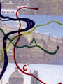
Description: At first I wanted to depict the accessibility of Prague in ink so that I would trace the outline of Prague, color it in black ink and would scatter the resultant “spill” to each direction so the main routes to the city would be represented. But then after I found out that I do not have enough black ink at my disposal – I decide for several colored inks. I used brown ink to draw the outline of Prague, blue ink for Vltava and Berounka, yellow, green, and red for the metro lines (A, B, C). I used the rest of the black ink to draft the most important routes to (from) Prague and to describe them using the names which they lead from (towards). Consecutively, I realized that these colored inks do not leave almost any blots (“spills”) for me to put my initial plan into practice (I was able to do that in the 1st grade of Elementary School, which was the last time I used ink, and ink blots were forming one after the other, but now I suppose they changed the way of making ink). Therefore, my map was insufficiently filled up (including to my knowledge from Cartography) so it came to me to glue a collage of photos of the most famous sights of Prague into the map. The result was made through copying of the ink drawing onto a tracing paper, which was further laid over the glued photos and copied again, and the final outcome came into existence! I consider this map to be the masterpiece of my artistic and creative skills.
85/2009 / Puzzle / Tereza RASCHOVÁ / 2009 / paper
Description: I am a realist and I need the facts of each activity, so this was quite difficult. Eventually the term was really burned, and the pressure often come up with something. I thought to do puzzles and not to reveal the name of the state that it was not so dull. The purpose is to pass a map to guess on the country in question. Hint: its city was the main subject of a great film. I used the outline of the State, which I found on the Internet, I drew the river, city (Atlas of the Word) and altimetry using color Hypsometry. Due to the requirement for visual processing, I worked with pencils and fixate instead of a computer, so please excuse my abilities. Free space I filled by flag and thematic images, scale and legend. Then I stuck the map on cardboard, cut up into individual pieces to form a puzzle and put in a labeled box.
86/2009 / DETECTED PERVITIN DENS IN CZECH REPUBLIC (2009) / Adam ZDOBINSKÝ / 2009 / drawning on gingerbread, gingerbread, chocolate, sugar glaze
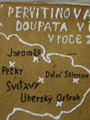
Description: Map is designed by sugar glaze on gingerbread cake, made from 3 eggs, 150g of icing sugar, 4 spoonful of honey, 50g of butter (Hera), ½ teaspoonful of bicarbonate, teaspoonful of milled gringer spice and ½ kg of smooth flour. For preparing of sugar glaze we need snow from egg white, 15 dkg of icing sugar and lemon juice. Next we need dish, pan, baking foil, baking-board and rolling-pin. Procedure: stir up 3 eggs and 150g icing sugar in dish, add 4 spoonful of warm liquid honey during continual mixture, consequently pour on 50 g melte butter (Hera) and ½ teaspoonful of bicarbonate, add one teaspoonful of milled gringer spice, add gradualy ½ kg of smooth flour during continual mixture. Incurred mixture carefuly mix as long as rise of denser matter. Mould everything on baking-board. Create cone and hold it fallow on baking-board for 10 minutes. Create cake by use of rolling-spin and cut it to requisite shape. Remove cake to pan and give it for bake on 160°C for 30 minutes. After cool down we can decorate it by chocolate and sugar glaze.
87/2009 / Map of the tolled roads and highways in the Czech Republic / Martina Bartošová / 2009 / pastel sticks, modelling, paper

Description: For a long time I had no idea how to make a creative map. Realy, I tried to think about this but there was still no idea in my mind. And so I hoped I will get this in some time. And it was the truth. When I was going home by the highway fom Praha to Mladá Boleslav, the box for a toll peeped for a few times. The Idea was born in this time – I will make a map of the tolled roads and highways in Czech Republic. I had also an idea to make this map creative and so I decided to draw this to the paper model of the van. I drowed pieces of the van to the A3 quarto paper and I cut them by scissors. After that details and windows, doors and recording addresses of the van followed. On the web site http://www.google.cz/ I found a map of the tolled roads and highways. After that I redrawed it into the trailer of the van. I made my project by pastel sticks because I can draw details better with them (I could not do this with water colours or temperas). If the map was ready, I would fix the trailer of the van. It was the end of my project, but there was still one problem: "how to transport my model to the Prague safely". I do not recommend this project to the people who are not so skilful because it is so hard to make pieces of the van in right sizes. Also fixing of the van is so difficult because you can make dirty all project.
88/2009 / The Neighbourhood of Klecany / Michal Kapusta / 2009 / soldering, electronical parts, ecuplex desk , wires
Description: I chose displaying the town district in which I live as a theme of my creative map and I wanted to use some unusual method of work. After I was doing some cleanup in my room during which I moved some old computer parts I realized that this could be my way of work. The process of creation was quite long one, because it´s much more faster to simply draw the symbol on paper rather than drill in a hole in ecuplexid, then bending the contacts, after smelt them with solder and tin and snipping the edges of remaining contacts. What was the hardest part was drilling the Title, legend or other map parts. It´s not simple writing and it requires a certain skill which I get soon after I broke only a couple of drills. There is quite a big disadvantage of this method due to the fact, that if some error is made, there is very small chance to "hide" it. It was also qute difficult to get all the necesaries,becaouse almost all the shops are for large-amount ordering only. It was quite a fun watch the store clerk in the electrician shop, when I replied that I do not care about the "values" of resistors but I do care about that samo parts must look as non-similar as possible. Hope you will like it.
89/2009 / Wine shops in Prague / Petr DUŠEK / 2009 / wine bottle
Description: For my creative map I was inspired by objels, that beautifies my student dorm room Švehlova in Prague. Some time ago I also searched online wine shop in Prague, where I could get a svatomartinské wine fair price. Since that was not far from the idea to map out precisely those objects. In our family in recent years began to cultivate a relationship of this kind of drinking, but only at the gourmet level. Parallel to the proverb: "What Lord, such a dog." In this case may be: "Like father, like son.", At least in terms of selection of alcoholic beverages. Data were found in today´s Internet age quite easily, I was surprised especially in Zbraslav shop, where I was really expecting. The largest concentration is in the city center, as might be expected. The original plan was to draw each wine shop specific symbol, but it was not viable to strike the seven symbols of Prague 1 is the description of wine shops, which then, as you can see, he was preferred.
90/2009 / Santa Claus vs. Christkind / Martin Hasa / 2009 / modelling, paper box
Description: Upcoming Christmas inspired me to select a pure Christmas theme. The primary guideline was an empty paper box that directly asked for a creative transformation.There were many ideas on the artistic realization, but finally an idea of a gift box including a map of an imaginary war of Jesus and Santa Claus. I chose to respond to the continuing commercial pressure of iconoclastic Santa Claus (in different variations in the European countries), that directs us to the non-value celebrating of Christmas holidays. However, there are a area island sof defiance in Europe. They simply refused to accept any reincarnation of St. Nicholas as their. The whole project got a form of Christmas gift, in which can be found a thematic map after opening. The map does not remain in two dimensions, small flags use spacein the box. The box is covered with ordinary Christmas wrapping paper. ArcGIS and Adobe Photoshop were used while creating the map. The biggest technical challenge in this work was gluing, wrapping paper for never went completely erased. That’s why the paper is glued only to certain places.
91/2009 / Regions in the Czech Republic / Zuzana Friedlová / 2009 / tipping, spice, paper
Description: I think I don´t have big fantasy and I am not to much creative so the biggest problem was to get some idea. But when I once rode in a tram, I saw a poster which invited people to the botanical garden to spice exhibition. And at this moment I remembered one hour of art at elementary school. We made pictures by gluing spices and other cooking ingredients on the paper. So I decided to make a map in the same way. The first I´ve prepared a map in ArcMap with the CZ border of regions, with labels of regions and regional cities. I have inserted a title, legend, north arrow, scales and imprint. The next step was to map ready to print and select and buy spices. In the end I chose for the 4 kinds of spices (= 4 colors) and for oregano (green), red pepper ( red), curry (yellow) and ground cumin (brown). This choice had no deeper meaning but the importance of aesthetics. Another tool that I needed was the glue. When I had everything what I needed, I could put in the work (it was not too much). I changed my mind, I´ll paint the individual regions and then I gradually coated with glue and I powdered a individual spices. The map will then just let it dry and my "creative" map was done. I do not know how much the map is creative, but it smells very nice.
92/2009 / Orienteering race / Petr ŠPICAR / 2009 / collage, paper
Description: I haven´t known what creative map make for a long time. However week before closing time, which we had, I had idea to make something, what is similar to me, what I have been doing. So I decided to make a map, which is making for orienteering. I have been doing this sport since 10. Good for me was, that this orienteering map I did last year. Because making orienteering map takes about month. In program OCAD I draw the stage on the map, then I made a legend, title and some pictures for better looking. After that I printed this and I could start with gluing the best routes on stage. It takes for hour. In the end, I´d like to say, that this map is situated near the town Jičín (it is town, where I live). And the goog geography knows, that Jičín is the town, which is called "the door to Czech paradise".
2008
01/2008 / Candy stores and coffee bars in Prague / Magdaléna Kašková / 2008 / cake

Description: One of the phenomena that define large Central European cities, including Prague, are cafés and patisseries. Besides the most famous Viennese cafés, there are also some good and traditional cafés in Prague, and pastry shops have an even stronger tradition in Prague. I can’t deny that I like to visit these establishments. For a long time now, during these visits, I have had the idea of compiling a map of the best cafes and patisseries in Prague. So I took the opportunity to use the pastry shops and cafes as a theme for a “creative map”. While searching for a suitable form for the chosen theme I came to an almost extreme solution, I admit. However, it has its undeniable advantages - the map in this form is recyclable (if the map becomes inedible, I recommend composting it) and it does not take up any space... I am aware of several shortcomings of this map. The first is the selection of the businesses - it is purely subjective and tries to capture the quality of pastry shops and cafes only through individual experience, or through a few references. (If the map had a longer shelf life, it would certainly be useful to modify and expand the selection). Another shortcoming relates to the timing, which is missing from the title - however, since the map is clearly less durable than any café and patisserie, I did not consider the timing (apart from the date of production in the tirade) to be important. The last of the errors I found is the not entirely satisfactory composition - I could not move the map field anymore, because it was stuck to the chocolate... I also apologize for the imperfect quality of the technical processing - this was the first time I baked the map... I believe that the experience of creating this map will make it easier for me to choose a profession in case of unsuccessful studies at the Faculty of Science.
02/2008 / Gingerbread factories in the Czech Republic / Martina Lískovcová / 2008 / gingerbread, chocolate

Description: “Cartographic gingerbread delicacy” For my cartographic gingerbread treat I needed: 350 g of plain flour, 180 g of icing sugar, 180 g of butter, 180 g of almonds, 1 egg, 2 tablespoons of honey, 5 tablespoons of milk, ½ teaspoon of cinnamon, a pinch of nutmeg, 2 cloves, grated lemon peel, 1 packet of lentils, 2 chocolate toppings (white, brown), 3 toothpicks. I mixed the flour, sugar, spices, grated almonds, grated lemon zest and kneaded with a mixture of melted butter, milk, honey and egg. I let the dough rest until the next day, then rolled it out and put it on a baking sheet, after twenty minutes I took it out of the oven and let it cool. I used the cold dough as a base for the map. According to the pattern, I painted the borders with dark icing and the watercourses with light icing. I used green for the important cities in the Czech Republic, red for the capital Prague and yellow for the gingerbread houses. I was still able to do the title in icing, but for the legend, scale and circulation I had to use “flags” made of toothpicks, papers and duct tape, thus actually giving the map a third dimension. The idea came about in connection with the approaching Christmas. When my mom came up with the idea that it was time to make gingerbread men so that they could soften properly, the idea was born. Therefore, I recommend postponing any consumption until Christmas time so that you don’t have to visit the dentist unnecessarily.
03/2008 / Public WC in Prague / Alžběta Rejtmajerová / 2008 / toilet seat, polyethylene

Description: I decided to create a map of public toilets because I didn’t see one anywhere, and I don’t know where to turn when I need one. The backbone of public toilets are the toilets in subway stations, where there is at least one at every stop. Then there are a few more in advertising columns that are fully automated. There are a few in stone buildings that are wheelchair accessible. Still, for Prague, I don’t think there are enough of them. In fact, if I am not in the centre or near the metro, it is assured by bushes, KFC, a good neighbour, toilets in a supermarket or ordering a Mattonka and going to the toilet in the first pub on the way. Another idea was the rendering. What is typical of a toilet? A toilet seat, of course. So, I decided to get a toilet seat, although it was a bit of a chore and whoever I asked if they had an older toilet seat by any chance looked at me quite astonished. So I thought I’d cut out a piece of paper to match the seat and draw a map on it. But then I saw an episode of “Friends” where Rachel teaches Ben all sorts of shenanigans. One of the things she mentions is putting food wrap over the seat. Great joke and a good idea for a map, draw it on a piece of cling film and put it over the seat. However, I had no idea how vivid it was and how hard it was to paint on.
04/2008 / Growing of cotton / Hana Pehočová / 2008 / bleaching, felt-tip, 100% cotton

Description: The first idea was to try to use silk painting techniques to create a silk-themed map, but due to the possible financial, technical and time demands, we opted for a more affordable cotton (although I dare not claim that the material is pure cotton). The aim was to create colourful continents on a light blue sea. Unfortunately, this was not successful because the colour “navy blue” is darker than it needed to be. The white line in the middle indicates the equator, unfortunately it moved “a little” further south than it should have been in the east during dyeing. I was forced to change the technique and use bleach instead of batik. I used the View from last year (Wetch’s map) as a template, because due to the theme it was enough to show the world only up to 60°N and 60°S. The thematic content, title, scale and legend were drawn with acrylic paints on textile. Typescript and source were written in alcohol marker.
05/2008 / Territories in the Czech Republic / Klára Šenkyříková / 2008 / embroidery, singlet
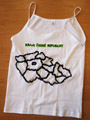
06/2008 / Flags of states in Europe / Gabriela Leipertová / 2008 / pastel, styrofoam and paper

Description: I found it a very interesting task to create a creative map. However, the question was what theme to choose. I chose “Flags of the European States”, as a political map of Europe to serve as a base and the flags of each country can be easily found either in an atlas or on the internet. I imagined a 3D map. I glued a sheet of paper onto a polystyrene plate, which contains the title, scale, legend, a tirage and a map box with the political map of Europe. I then stenciled the flags of each country onto the political map. I made these out of toothpicks and paper. The toothpicks have a sharp tip so that they stick well on the polystyrene. I printed out the flags on the computer, cut them out and glued them to the toothpicks. Unfortunately, I haven’t solved the problem of how to make them double sided. This map is a great learning tool: after removing the flags from the political map, we can see for ourselves if we can put them back in the same place.
07/2008 / Wood-density in the Czech Republic in 2001 / Anna Procházková / 2008 / beads and paper

Description: The original intention was to create a creative map based on the principle of folding cribs, which would very well represent the chosen theme of forest density in the Czech Republic, but to be sufficiently illustrative, this pyan would have to be realized on A3 paper, so it would become a very complex work. Therefore, I chose only a “tree” raster to represent the density. The highest density of forestation, as the legend already shows, is in the regions where the smallest and most densely “planted” trees are and the lowest density is in Prague, where the phenomenon is represented by only one large tree (which is not very clear due to the small size of Prague). The “creative element” is the beads, which in orange-red colour symbolize the borders of the Czech Republic and the borders of the regions are represented by green beads. I could not put the beads in the legend to frame the “rectangles” because the chosen grid, which symbolizes the aforementioned density of forestation, would not be visible through them.
08/2008 / Poetry in Slovakia (from classicism to present time) / Štefan Poništiak / 2008 / pastel, book and cover of book

Description: I decided to make a map that shows the birthplaces of the “greats” of Slovak poetry in a cross-section of literary development. I had the basic information from Slovak language lessons, it was enough to use the map server of the Slovak Environmental Agency to locate exactly their hometowns or towns. The motivation for me to make the map was the possibility to create a new style of the map, because so far all the tasks were in a way “painted”, i.e. what should and what cannot be accepted anymore. So I thought I’d give it a try, even though I didn’t have any suitable ideas at first, I expected that the idea would somehow come with time, plus there is the possibility to score points as well. My initial enthusiasm for making a creative map was caught when I travelled to Bratislava to visit a friend. I started from Prague in the morning, happy that I would soon be at the finish line. One change in Pardubice was enough, but as it happens, not every day is a Sunday, so Czech Railways somehow didn’t have their day, which was reflected in the fact that I arrived in the capital of the Slovak Republic in deep darkness (luckily I still knew my girlfriend:-) and so I thought I would make something where I would play with the level of travel on the trains coming out of Prague. Gradually I was coming to the conclusion that it probably wasn’t such a good idea, as it would probably be unacceptable rather than creative. So I figured I’d let the creative map float. In the meantime, I bought a book, which incidentally forms the main weight component of my “consignment”, and when its cover started to get significantly damaged (admittedly it was already damaged, as it’s an older title), I started thinking about how I used to wrap my notebooks and books with self-made paper wrappers. And when I was able to figure out roughly what it might have been like in my youth , I figured I’d put something in there to illustrate it, and the creative map was the perfect opportunity. And why this? Recently I’ve been communicating extensively with friends studying Slovak language about Slovak poetry, and for my own curiosity, I thought I’d make a sketch of the places where our poets went out into the world. That’s how the main form of the “map” came into being, and I chose our national colours as the background, since these are Slovak poets, smudged in the style of the impressionists (I sharpened my crayons - actually only red and blue were enough - on the map field and smudged it with my finger).
09/2008 / Castles in West-Bohemia / Marta Škardová / 2008 / tempera, felt-tip, wood
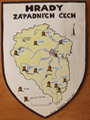
10/2008 / Breeding of pigs in the Czech Republic in 2007 / Lenka Hladíková / 2008 / pastel, paper

Description: For my creative map I chose the topic Pigs in the Czech Republic, mainly because of the good availability of data from the Czech Statistical Office website and also because the topic will be well represented visually. In the creation of the map, mainly oil chalks were used, sometimes supplemented with crayons in small areas that would be difficult to colour with chalk. A thin black marker of two different sizes was used for the type, scale and outlines. Finally, the areas coloured with chalk were fixed, this should prevent further smudging of these areas. The map is created for clarity only for the regions; in addition, for practical reasons, Prague is merged with the Central Bohemia region. The format of the map is slightly smaller than A2, so that the small details of the drawings stand out. The entire map composition is drawn on a quarter in the shape of a pig, which reveals the theme of the map from afar. The map contains all the obligatory compositional elements, and for lightness it is supplemented with a cartoon image that corresponds to the theme. My main goal in creating it was to make the map something different from all the austere and serious maps we make in the exercise. The result should show that even an accurate map can be cheerful, funny and original.
11/2008 / Metro-station “Dejvická” / Ondřej Václavek / 2008 / collage, what was available

Description: The creative map was made in the form of a collage based on an idea that came suddenly and was very suitable for the situation with the lack of points. The individual parts of the map were created gradually as new ideas came. The first idea was to make a map of the subway, because it is probably my favourite means of transport in Prague. I chose green paper because it is the A line of the metro, which is green in colour. Another idea was to create stairs out of a material that fits the theme. So the folded Prague public transport ticket represents the stairs, or Escalators, which are located at the western exit of the Dejvicka metro. One ride on the metro reminded me that it is not in the best condition and that the tracks are quite worn and could easily break, as a skewer could, so this object symbolizes the tracks. All the stations have an information board and a supervision room in their centre, for which I have chosen specific signs, i.e. a board with a sign and glasses to symbolise the supervision of the station area. For me, the big problem in the metro is the mess that people leave behind. That’s why in the centre of the map there is a large, crumpled poppy seed wrapper and a cigarette packet, which I came across a week ago in the Dejvická metro, waiting for a connection to Můstek.
12/2008 / Bad dream of eurosceptic Václav Klaus / Jan Roháč / 2008 / collage, paper and match

Description: There are two reasons for this creative map theme. Firstly, I think that this topic is quite topical and with the passage of time it can also serve as a certain legacy of the times. It also has nothing to do with sympathy or antipathy towards President Klaus. I have been looking at this topic quite objectively, although of course I have my own opinion on this issue, but I do not want to incorporate it into this map in any way. I also decided to make this map because I just had a poster of President Klaus, which ended up in my hands quite by accident. A friend of mine is very fond of building paper models. His domain is cars. It’s also worth adding that he’s considerably “people’s democratic” oriented. Recently he was able to get a model of a Tatra President, but when he asked the saleswoman for a model of the President, she brought him three rolls of posters with a picture of President Klaus. Unfortunately, my friend found out only at home and the later complaint was disregarded. So he wanted to get rid of it as soon as possible because of his ideological beliefs. So that was the end of the President in my hands. As further material I have used newspaper articles that also relate to the subject. Unfortunately, I didn’t have that much fresh material at home, so I was forced to photocopy some of the articles from newspapers in the library, so they don’t look as authentic as I would have liked. So from these two pieces of material I then cut out an outline of the European Union based on a template obtained from ArcGIS. Unfortunately, due to technical difficulties, I was not able to capture the borders of the European Union in a more sober shape. This is also the reason why the scale is not entirely accurate, but I primarily wanted to capture the approximate shape of the European Union, which I think I managed to do, I also wanted to have a map a bit more colorful and so I used other tools, for example a match, which served as a north. I eliminated Switzerland on purpose, as a kind of symbol of neutrality.
13/2008 / Emblems and flags of districts in Prague / Alena Rodová / 2008 /
Description: The smallest parts of Prague are cadastres, I downloaded them from the Cenia geoportal. Larger territorial units are city districts. They have their own emblem and flag. They depict the history and the past. I thought it was a good idea to make this map. The signs “stand”, they cover their territory. If I wanted to show the emblems in 2D, they would completely cover their territories. Even like this they hide the borders quite a bit for me, but it can be tolerated. The main idea was to illustrate what a district has as symbols. Putting the flags next to the symbols would be completely cluttered, which is why they are stuck around. In the left part of the map the flags are arranged in order Praha l - Praha 22, in the right part the flags are arranged alphabetically. I wondered whether to put a uniform background color so it wouldn’t look like a “canary”, but delineating 22 administrative districts wouldn’t stand out at all. I therefore chose different light colours. The larger characters indicate the municipal districts of Prague l - Prague 22. While gluing the signs and flags I mastered the names and locations of all the districts of Prague.
14/2008 / Galleries in centre of Prague 2008 / Kateřina Novotná / 2008 / wall-dyes, cardboard

Description: I spent a lot of time thinking about what I could actually do for a map. At first I thought I would make a hat, as a traveler’s aid in a fictional country, but the hat would have to be absolutely huge, because I wanted to paint vegetation strips as pictures. And I didn’t have the cardboard size for that, plus I was afraid it would break as I bent it and the quarter would be weak again. Since I was determined from the beginning that I wanted to paint with wall paints, it almost looks like tempera, only they have one flaw, they dust off unlike tempera. I’m thinking further. So I’m sitting down to do the hat and lo and behold brother, how about doing a gallery of Paris on a palette. I say, try and find them on the map. Hmm, it’s got one flaw, it’s almost in the same place, it won’t work. And that’s when Mummy says, so do them in Prague. And so I sat down over a map of Prague and looked for galleries. They’re better spread out than the ones in Paris. It’s decided. Fortunately, they’re not all over Prague, but they’re concentrated in the centre of Prague. I start drawing. First, to sketch the palette, it’s a good thing I have a model. My own palette. That’s what we should have. Now I have to sketch my own streets, squares, greenery, the Vltava River. A bit of a problem in an irregular shape, but hopefully I’ll get it right. In the end, I’m quite happy with my creation, although there are some inaccuracies, but it’s a creative map, anyone could hopefully find their way around. Now it’s time for the title, subtitle, directions, edition, scale, etc. How about using a paintbrush as a guide, I think? Quite a passable idea. It’s oblong, so why not. So I get to drawing. And tempera? That could form a scale, so it appeared on the palette as well. Typesetting, I can’t do it in a computer font, it’s artistic, so how about rounding it out a bit? That would work. Title and subtitle the same. The problem was the cartographic character for the galleries themselves. I couldn’t think of anything, but I tried pitching it to the neighborhood and the immediate response was, “I’d like it if there were painting easels.” So I thought, why not? Better than little pallets. So I made a stencil and traced it. Now it was time to paint. This is my favorite stage. I like to mix colors, so my decision was to use colors right away. At first I wanted to start in an impressionist style, to use pointillism, but in the end I resorted to the strokes I always use as it looked better from an aesthetic point of view. And so I started painting. Finally, when the whole palette was dry, I took a black marker and started writing the names of important streets, squares and the names of galleries in the easels. And at the very end, the hole to hold the palette and the palette itself had to be cut out of cardboard.
15/2008 / Attractiveness of female face / Jiří Valeš / 2008 / face as a topographical surface

Description: In constructing my work, I tried to apply the rules of cartography not to the surface of the earth, but to the surface of man. I wondered if it would be possible to create a map without a landscape so that it still expressed something, and I also toyed with the idea of “How to throw a woman into a map”. It’s also, figuratively, about territory, and no less important. To make a purely topographical map of a face would mean cutting out the eyes, ears, nose and mouth from a photograph and putting them into the legend one by one, and that seemed morbid to me. So I chose a thematic map about the attractiveness of the face and used the gradation of one color to “occlude” it. Of course, the map is not based on any data from observing men observing women, but from my subjective assessment. However, I don’t think it is somehow significantly different. There is an interesting similarity to the Gould-type mental map. I’m aware of all the practical shortcomings of the creation that arose from my first confrontation with Adobe Photoshop and late night hours.
16/2008 / “So here I was too :-)” / Hana Pevná / 2008 / textile-dyes, T-shirt
Description: This creative map records my travels abroad. It consists of a trick and a set of maps that can be changed on the trick. The advantage is that the maps can be constantly updated. The maps are drawn on the fabric with fabric paints that should withstand machine washing. Thanks to the buttons on the back of the shirt, I can change the maps all the time. In case of visiting other countries, you only need to draw another map. The size of this t-shirt, which I could use as a nice nightgown, was chosen to reduce the cost of making the map. If the t-shirt is mainly hand washed, it can last a very long time.
17/2008 / Wonders of the World in South America / Lenka Danková / 2008 / aquarelle and pastel,

Description: From the very beginning I wanted my map to be a bit playful, but on the other hand I also wanted the map to be meaningful. That’s why I chose the wonders of the world as my theme. However, it would be very difficult to cover the whole world and I think the map would look a bit cluttered. That’s why I chose only one continent, but in my opinion the most remarkable, South America. I used the Book Club’s Wonders of the World encyclopedia as a source of information. Overall, the map was conceived as a collage. The base is the map of South America itself. It is a political map with basic topographical features (major waterways and areas). Each state has its capital marked. The base also, of course, contains the basic compositional elements (map field, title, title, legend and scale). The whole map is then drawn in watercolours because of their great colour variety and subtlety. To the basic part are attached selected world wonders located in South America. Each is painted on a separate card. On one side of the card is an illustrative picture of the chosen place, again drawn using the watercolour method. However, I chose the colours not according to reality, but according to my mood. By this I wanted to refer to the artistic direction of expressionism. On the other side of the card is the name of the place with a short description. The whole card is then attached with a pin and pinned into place on the map.
18/2008 / “Microregion Úpa” / Lucie Červená / 2008 / collage,

Description: I’ve been thinking about an idea for my creative map for a long time. Then I got sick and I had plenty of time, so I took to bed various books (I was thinking about a historical map, for example), atlases and a whole series of promotional maps and brochures - mainly about East Bohemia. The promotional brochure of the Microregion Úpa caught my eye, in which each member municipality had one page dedicated to it, with a short story about that municipality, one “main” photo and several smaller, complementary ones. And the idea was born! At first I thought of cutting out only the main rectangular pictures and gluing them on the paper, keeping only the neighborhood of the respective villages. I planned to do the same with the text for the second map next to it. Only, when I cut everything out and started piecing it together, I found that it wouldn’t work - in one part of the micro-region, I couldn’t stack the pictures to keep the neighborhoods true (I didn’t even try with the texts after that). So I had no choice but to start thinking of an alternative - the only one I could think of was to draw the exact boundaries of the cadastral areas of the member municipalities from GIS and paste the already cut out pictures into these areas and describe the rest of the place with the information from the brochure. Here too I encountered some problems (large x too small area of the municipalities, sometimes very rugged borders) and mainly the constant fear that when I am almost done I will mess something up, I will misspell somewhere - which I did with the scale (to which I accidentally added one extra zero, but fortunately I managed to disguise it quite well and “scale up” to true again).
19/2008 / XXIX. Summer Olympic Games in Peking in 2008 (attendance of states) / Michaela Šákrová / 2008 / collage,

Description: After about a week of thinking, somewhere between dreaming about winning the Czech Orienteering Championships and reflecting on the day already passed, I had the idea to make a map showing the Olympic rings. The morning after I woke up, I started to develop my idea and came to the later project, which is to record the continents in their respective circles and mark on them the countries that participated in the last Olympics (since I am quite interested in sports, I was enthusiastic about the topic from the beginning and dug through all the information). For the actual creation, I first displayed the entire world in ArcGIS (in a cylindrical view) and then divided it into continents, with national borders thrown in. I kept the cylindrical view so that it would be noticeable that it is a single entity only “torn” into individual circles. I represented the circles with torn paper that I glued around the pre-cut continents. I divided the continents into circles according to a commonly known fact (Australia and Oceania - blue, because of the ocean; Africa - black - Black people; America (South, Central, North) - red - Indians; Asia - yellow - according to skin colour; Europe - green - grasses). I don’t know about Europe, but that’s what they say:-). Then I used a crayon to record the participating countries on the map according to the list from the official website of the Beijing Olympics (this took me probably the longest time = three evenings). I didn’t know how to use the scales for a long time, but finally, after consulting with my dorm mates (good thing there are so many GEKA:-) I printed them out, cut them out and glued them on colored papers according to the affiliation to each circle. Finally, I pasted them into the map in order (I started on the bottom right and ended on the top left. Finally, I would just like to state that I made the map because I had an idea and I also enjoyed it very much. But when I found out after a few hours of colouring in each state that all of them actually participated, I was pretty pissed. I wouldn’t want to spend so much time on it next time.
20/2008 / On the journey in Morocco (Feb 2008) / Blanka Pechačová / 2008 / collage, paper, sand, stone and shell

Description: My creative map came about as a result of thinking about what I could get rid of at home if my creation never came back. The first thing that came to mind was the excess reddish sand from the Moroccan Sahara, the Erg Chebbi desert, along with a few rocks and sea wash that I brought back from Morocco at the end of February this year. Then came the idea to glue it all on paper. Then I tried to paste the whole map field with collages of my own photographs, so that the minerals lost their original purpose and served as “decoration”. In the end, I decided to include some topographical data (even if only schematically), including a representation of where we had travelled, by what means of transport and where we had spent the night. Notes on the characters: 1) The overnight symbol is placed either next to the place visited or next to the route of travel - that is, it means that we spent the night on a bus, train, etc. 2) On each of the journeys (train, bus, grand taxi) I have indicated the direction with a small arrow direction of travel. In conclusion, I would like to summarize that the creative map “On the Road to Morocco” should not only show what geological material the North African country has, but above all, with the help of photographs, it should make the reader aware of the beauty he can encounter across the Strait of Gibraltar, and moreover, it can serve as a brief guide to circumnavigate Morocco in just eight days, seeing the most interesting places.
21/2008 / “ONE MAP IS MORE THAN TENS OF BOOKS” / Michaela Malá / 2008 / Idea: all objects and phenomena in map only as text information

Description: It was this favourite instruction of Prof. Voženílek that gave me the idea for my creative map. My goal was to make the map accessible to people who have no experience reading it, people who have no idea what map marks or color in cartography represent. But it had never occurred to me before how few elements could fit on a map if we replaced the agreed markings with plain type, and that instead of making the map clearer, the result was rather cluttered, but despite trying to create a map without any knowledge of cartographic rules, I automatically used the colour blue for the watercolour. So it is not entirely easy to break free from the established rules. But one big advantage this “written” map has is that it does without a legend, because the legend is the map itself. But why do we need a map of the Czech Republic, which contains only the borders of the state, the basic watershed and the division into Bohemia, Moravia and Silesia? It could be said that the artistic value here prevails over the narrative value. Rather, the map gives the impression of a geographical calligram. But why not, I have so many times looked at a map as a painting, a work of art that captivates one even without enriching one’s geographical knowledge. And I look at my creative map in the same way.
22/2008 / Ptolemy cone map projection / Petra Bromová / 2008 / silk-dyes, tie

Description: When I started thinking about creating my own creative map, I definitely wanted to create it on some unconventional base. In the end, I decided on silk. Although painting on silk is already a fairly common technique, I had never tried it. That’s why I was a little scared of it too. I thought of tie-dyed ties, but what to do with their rather unusual shape for a map? They’re just right for making maps of the Earth’s meridian belts! From the known geographic grid representations, I chose Ptolemy’s cone representation in normal position. The North Pole is not a point and the distance between the meridians increases towards the south, which exactly matches the properties of the tie. I got the silk tie and the colours quite easily. All I had to do was to start painting. First, I traced the outlines of the continents and the geographical grid with black outline. Once the outline was dry, I painted the areas of the continents black. Of the two activities, contouring proved the more difficult because the tube didn’t want to give off as much color as I wanted. But everything turned out well in the end. Moreover, the contour lines were quite thick, so I had to write compositional elements such as the edition, scale and subtitle with a fountain pen.
23/2008 / Copy-centres in the Czech Republic / Markéta Koropecká / 2008 / Idea: Idea: 1 paper in the bundle = 10 copy-centres
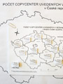
24/2008 / Emblems and flags of territories in the Czech Republic / Filip Hájek / 2008 / collage, dental-material and string, teaching aid

Description: Creation of the map: the map was created on the basis of my decision to devote myself at least partially to cantorial activities in the future. I think that in today’s primary and secondary school curricula, despite the improving situation, there are still few teaching methods based on “practical activity” of pupils and students. Yet it has been proven in psychology that it is through practice and activity (both preferably in a fun form) that almost one hundred percent of them learn to perceive and learn the material discussed many times faster and remember it much longer, thanks to the use of the right hemisphere of the brain. This map project should serve as an example of the use of the above in geography. I think that if geography and cartography societies started to pay extra attention to this sphere of creation, which would certainly not be a problem with today’s technological advances, geography teaching would certainly take on a new and better dimension. The students, (and users in general) would learn better and the companies would be richer, not only in finances, but also in good feeling:). Purpose of the map: this map should have a practical-educational function. It is designed so that its user can learn the names and locations of the regions of the country and recognize their vexillological characteristics (in this case, flags) well, quickly and efficiently. Using the map: it is based on two flag positions: A) Flags in the map field (in the counties): we look at the location of the region and its flag (also from the other side, where the correct geographical location of the region belonging to the flag is shown), this way we check the correctness of the initial situation, we take the flag out of the stand and try to match it to the correct name of the region in the legend, we find out whether we were successful by flipping the flag to the left side after inserting it into the stand in the legend (CAUTION!), revealing the box with the correct flag belonging to the name of the region in the legend. B) Flags in the legend: check that the flags are correctly matched to the county name (according to the flags in the reveal boxes), look carefully at the county names, remove the flag from the stand (CAUTION!) and try to insert it into the handle of the correct county in the map box, we will find out if we have been successful by looking at the other side of the flag, which shows the correct geographical location of the county to which this flag (flag) belongs. We repeat situations A) and B) over and over again. This exercises our memory and perception while we learn.
25/2008 / Water usage in the Czech Republic in 2006 / Romana Musilová / 2008 / PET water-bottle (5 litres)
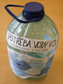
Description: I chose the topic of water consumption in households in the Czech Republic. The main reason for choosing this topic was the idea of its artistic treatment. I thought that I could connect the theme of water consumption in households with a frequently used material, namely plastic - specifically PET bottles. I first searched the internet for suitable data. The most suitable data I found was from the Czech Statistical Office - from the Environment and Agriculture section. I chose the data on water consumption in households. I then sorted the data into intervals and created a preliminary legend. I thought about what art technique I could use. At first I wanted to draw the map field using paints on glass, or using markers on foil, but this would not be technically possible because I would have no way to draw the Czech Republic, it would be impossible to put the template inside the bottle. In the end, I had to choose to glue all the compositional elements cut out of the paper onto the bottle using a melting gun. Next, I thought about how to express the given value of water consumption in each region. In the end, I chose to express it quantitatively using paint. I chose a colour scale, and given the theme of water, I chose different shades of blue. On the website of the Czech Statistical Office I looked up a map of the Czech Republic - administrative breakdown by region. I traced the map, copied the scale. With crayons I coloured the regions according to their belonging to the given interval. Then I got a five-liter PET drinking water bottle. I stripped it of the label, and instead used a hot glue gun to glue on the map field I had created. Next, I created a legend on paper, wrote the title and subtitle, then the source and the circulation. I cut out all the compositional elements and then glued them with a hot glue gun.
26/2008 / Types of country-cottages in the Ukraine / Dzmitry Kozhukh / 2008 / collage, phonograph record

Description: My creative map consists of three of my interests: 1) I like modern dance music (drumNbass) and DJs who play it from a turntable. 2) I also like to read books about different aspects of Slavic folk culture. 3) And I also like cartography :D. That’s why I decided to put all those interests of mine together. In addition to that, I think that making different parts of the cottage separately from cut vinyl is a good idea by giving the possibility to compare those different parts of the cottage (like the roof, facade etc) in different regions of Ukraine. Another interesting thing is the connection between cottage construction and “constructivism” :). I also tried to make something constructive out of those parts.
27/2008 / Land-use in Psárov in 2000 / Barbora Havlíčková / 2008 / glass-dyes, polyethylene and paper
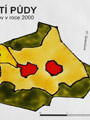
Description: I used the theme of the creative map as the theme for the first map, namely land use. I chose the village of Psárov. I found out the land use from the website www.geoportal.cenia.cz (CORINE 2000), where it can be seen that most of the area of the village of Psárov is occupied by coniferous forests and then arable land. I printed the resulting map and then traced the map field and part of the legend on transparent boards using glass paints. The rest I left on paper in PC form. Then I just joined the two parts together so the resulting map can be hung as a picture.
28/2008 / McDonald´s restaurants in Prague in 2008 / Marie Sixtová / 2008 / eat-container

Description: In the context of making a creative map, I decided to deal with McDonald’s. Why “Mekáč”? I like to visit these restaurants even though I know that Hamburger, Cheesburger or Big Mac are not very healthy. How did I go about creating it? I wanted to use a paper box or cup and draw a map on it. However, the cup wasn’t very suitable, so I used a lettuce box. I had to think carefully about the whole process as I only had one box. First, I found a map on the website geoportal.cenia.cz, namely the capital city of Prague with 22 administrative districts. I redrew the base on paper and coloured the areas of each district with crayons. Next, I used a marker to highlight the boundaries (of the administrative districts and the territory of the capital city of Prague). Then I calculated the scale. Next, I worked on the legend, in which I placed the signs for the borders and for the McDonald’s restaurant. On the edge of the box, I placed the tirage. All I had to do was find out where the restaurants were located in Prague. I found this on the McDonalds.cz website. I didn’t forget to mention the relevant data sources. I drew a sign for the restaurant on a transparent lid. I glued the map itself on polystyrene and placed it inside the box. I stuck toothpicks into the locations of the restaurants. The most challenging part was to make sure that the position of the characters drawn on the lid matched the position of the toothpicks. I was trying to show that even "garbage" from food can still be used, hopefully I succeeded. From the point of view of a future teacher, I think that the creation can also be used in a geography lesson. Maybe there will be other “scavenger eaters” in the class who will be interested in my map. I enjoyed working on the creative map. I was pleased to be able to use my own imagination. And I have to admit, I immediately got a craving for a double cheeseburger while creating it.
29/2008 / Town Krnov / Petra Pitelková / 2008 / collage,
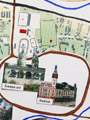
30/2008 / Selected mineral-waters in the Czech Republic in 2007 / Šárka Kunová / 2008 / PET water-bottle (1.5 litre)

Description: My creative map is called Selected Mineral Waters of Czechia and it is supposed to show the places (cities) where the mineral waters are produced (bottled) or where they come from. I chose the waters (acids) from the list of members of the Mineral Water Association and at my own discretion. To identify them, pictures of the bottles of each brand located outside the country are used, which is further divided into regions for greater clarity. The whole map is arranged on an “unknown” bottle and can be considered as a kind of general “label” that can give information about the production of the waters. As far as the production of the map is concerned, I used only simple tools, the map field is created in ArcGis and further I created manually using glue, scissors and paper, gluing the individual “bottles” to the respective municipalities and finally I glued the whole label to the real bottle. The work was not complicated or time-consuming, but I think it fulfilled its purpose sufficiently and the result is acceptable.
31/2008 / Map of Egypt for children / Lenka Uvízlová / 2008 / Idea: map as toy for children

Description: You are holding a creatively rendered general geographical map of Egypt. Together with the map elements and a small picture of a camel in the colours of the Egyptian flag, it is drawn on the symbol of the country - the pyramid. This map has a wide range of uses. Above all, however, it is a teaching aid for primary school children. The interesting design will attract the child’s attention much more than an ordinary map in an atlas and will allow him to better remember the information. Thanks to the hanging system in the form of a string, the map can be placed in the child’s room, for example, under a chandelier, under a lamp, etc. He can therefore draw information from it continuously. The production of this effective aid for little geographers is very easy. All you need is a quarter preferably A3 size, a ruler, scissors, glue, string, crayons and markers and of course some source of information or a base map. In my case I used the School World Atlas.
32/2008 / Police of the Czech Republic: District Division in South Bohemia in 2009 / Ondřej Skolek / 2008 / Idea: map as the logo of Police of the Czech Republic

Description: I have tried to make the map look as much like the emblem of the Police Department as possible. Each district is supposed to represent a point of the star. The shapes, sizes and orientations of the districts are greatly distorted, but I wanted to make the map as interesting, unusual and interesting as possible. My intention was to make some promotional material rather than a precise map. Nevertheless, I tried to preserve the shape of the territory and the location of the district departments as much as possible.
33/2008 / Galleries in Český kras (Czech Karst) / Anežka Paločková / 2008 / printing, felt-pen drawing, paper and tracing-paper

Description: The inspiration for this map came from a visit to the Český kras, especially the quarries of Velika and Mala Amerika, with anthropogenic lakes and a large number of mostly blocked entrances to adits. During the totalitarian regime, the adits were the place of suffering and death for many political prisoners and convicts. Many mysterious and frightening tales are still told about them today. I am very attracted and interested in this area. I would like to go here one day to explore, whether scientifically or just purely as a tourist. That’s why I chose this topic to work on, to create the necessary map and get new information about the area. I drew materials mainly from the internet and my own knowledge. I obtained maps of individual adit floors, a tourist map of the Bohemian Karst and orthophotos. I wanted to combine all this into a single map while maintaining a relatively good clarity. So I drew on white paper the individual adits, differentiated by colour, according to which floor they are on. In grey I indicated the position of each quarry for better orientation. I overlaid the white paper with a pause paper, on which I drew the terrain surface - forests, fields, quarries, roads... This way I overlaid two maps, each of which has its own legend, but the scale, direction and other compositional elements are common. The map is thus suitable for moving both on the surface and below the surface of the area. It is relatively small, which adds to its practicality. Just fold it in your pocket and go... Of course, this is also matched by the amount of information contained in the map. It is only an overview and does not give detailed reports on the status of individual adits, elevation, etc.
34/2008 / San Siro: placement of seats in relationship of ticket price / Jaroslav Skoumal / 2008 / pastel, pencil,
35/2008 / Egypt / Martina Seidlová / 2008 / pastel, felt-tip, collage, photos,
36/2008 / Town Mladá Boleslav / Petra Beránková / 2008 / indian ink, Idea: form as in early maps
Description: After a lecture on Creativity in Cartography I decided to try to make a “creative” map. Since I have always liked old maps and imaginative maps (from different movies), I wanted to try to create such a map by hand. Following the suggestion that we can make a map using some well-known art technique, I decided to use ink. The result is a simple black and white map, probably the most similar to historical maps. At first I didn’t know what territory and how big I should make it. Then I thought that it would be best to stick to the territory that I have on the Thematic Cartography - my place of residence - Mladá Boleslav. I showed; classic physical-geographical and socio-geographical elements. I marked forests using the tree sign and elevation using the hill method (here I didn’t know if there were any rules so I followed my intuition and marked the highest points and elevations). In order not to make the map too “cluttered”, I marked only the most important villages and only expressways and class I roads. For the two most important towns (Mladá Boleslav and Benátky nad Jizerou) I have drawn important monuments (this way the importance of these settlements will stand out). The map contains all the classical basic compositional elements - title, legend, scale, edition, map field - and some additional elements such as directional signs and pictures. The images include the ruins of Michalovice, the Loreto in Kosmonosy, the emblem of Škoda Auto, an important company for the area, and the coat of arms of Mladá Boleslav. I have chosen important monuments and things characteristic for this area. I liked working on this map because I like to draw, and the resulting map is at least original.
37/2008 / Most cheapest petrol station (Natural 95) / Jana Kloučková / 2008 / pastel, cover of road atlas

Description: First of all, I should probably start with why I chose this map. It was because I travel a lot, I play competitive table tennis, and we go to matches all over our country every weekend. I used to not care where we got gas or how much, my dad drove with us every time and he paid for it too. But since I’m 18, my parents have been entrusting me with the car and I’ve been driving alone with my friends. Since then, I’ve been looking where the gas is cheaper and trying to save money. So when we were given the task of making a creative map, it wasn’t hard to decide what it would be about. The cheapest gasoline in the country clearly won out. I found the data pretty quickly and easily at www.ceskybenzin.cz. But for a long time I didn’t know how to create this map. Since I don’t have much artistic talent, I opted for a very simple creation using crayons and pencils. I traced the outline of the republic and added all the dates including the names of the cities and prices. But then the next problem was what to place the map on. I thought about a gas can or a model car. I don’t know if I solved it perfectly, but the best solution seemed to be to place it in the car atlas. Why couldn’t our car atlases have a creative one in addition to the classic maps. I think if we had a similar map every time we went somewhere, we’d be happier that we were able to save money sometimes.
38/2008 / Bilberry in Beskids over 1200 meters above the sea level in 2008 / Vladimíra Pavlicová / 2008 / pastel, Idea: interesting map key

Description: When I thought about the topic of the creative map, I remembered the holidays. During this summer I have camped on the five highest peaks of the Beskydy Mountains (in some places several times) and almost everywhere I ate blueberries. It should be noted that this summer was really good for blueberry lovers (among which I count myself). So I had a theme, but how to portray it? On the computer I created a title, a circulation, a signpost, labels. I decided to represent the occurrence of blueberries only above 1200 m above sea level. I drew each hill using the hill method, taking 1200 m as a constant (corresponding to l cm). The height of a hill above 1200 m above sea level corresponds to the size above l cm in the map (with l mm corresponding to 10 height meters in reality). I remember the actual height of each hill, as I have been on them several times. Finally, a legend. I have divided the amount of blueberries that could be picked in the Beskydy Mountains this year into three categories. The category “blueberries only” itself suggests that this is an area where you won’t find blueberries, although blueberries do grow there. You may find it strange that on Lysá hora, the highest hill, there are only blueberries. This is due to two circumstances: 1) there is a bus to Lysá hora 2) it is the only one of these five hills that has a pub on the top (even two). Therefore, there are almost always plenty of people there to reliably pick the few blueberries that have grown. The next category, “Mouth Only”, means that blueberries do grow in the area, but there aren’t many (which is why it’s not worth picking them in a bowl to bring home). The last category, "for pie", means that the hills are completely blue. You can pick as many blueberries as you want there, so you won’t regret baking a blueberry pie with them at home (plus you’ll pick blueberries for a pie in no time). If you like blueberries, go to Kněhyně or Smrk next year. You won’t meet crowds of people on the way like on Lysá, so you have time to enjoy the beauty of the mountains, and at the top you will be rewarded with a sea of blueberries.
39/2008 / Parliamentary election and Government / Martin Štros / 2008 / Idea: cartographic representation of birthplaces of members of the Government of Mirek Topolánek

Description: I have created a map of the current government of the Czech Republic. The map was created by finding out where in the Czech Republic the members of the current government were born. Small photographs of them were then inserted at these locations within the Czech Republic. The result is an overview of where our main political leaders come from. The map is based on the results of the 2006 Czech parliamentary elections, from which the current government emerged. For the districts, it shows which party won in the region. The aim of the map is to present our political representation in a non-traditional way, to find interesting features in the territorial distribution of the birthplaces of the main contemporary politicians and to find any possible correlation with the election results. Several interesting features were found on our map. A large number of politicians are from Prague and the surrounding area, more than would correspond to the share of this area in the total population. Due to the areal extent of the photographs, it was not possible to place the portraits in exactly the right place in this case, but it was necessary to move them. Two of our ministers, both from the same political party, come from Tabor, and the strip of government officials on the border with Slovakia is also interesting. Another interesting feature is the minister Djamila Stehlikova, who was born in Kazakhstan, which had to be resolved in an unusual way in the map field. It was not possible to place labels for the politicians in the map, i.e. their names, position or party affiliation. This would probably have been interesting information, but would have reduced the readability of the map.
2007
01/2007 / Political Map of the World / Antonín Bačo / 2007 / collage,

Description: I don’t know when and how I came up with the idea to do this, but somewhere in my head I have a memory of a painting of a certain style and artist where only three colours were used - red, blue and yellow. However, having been instructed by last year’s cartography, I realised that a minimum and maximum of four colours was needed. Therefore I decided to add green (it seems to me the most appropriate). In Adobe Photoshop I then created a four-colour map of the world (Braun’s representation; here I made good use of the materials from last semester), which I printed out, then cut and cut the resulting shapes into hard paper and glued onto a quarter. Sometimes side by side, sometimes over each other. This process took approximately 7 hours. In conclusion, I must add that I definitely do NOT recommend making maps like this! Nevertheless, I wish any naive interested parties a lot of patience when gluing Lebanon and its similar countries (hopefully they will at least buy better glue than I did).
02/2007 / Black sea: bathymetry / Lenka Horáčková / 2007 / pastel, Idea: attractive map key

Description: Since I don’t consider myself a creative person, I only started looking forward to the creativity map the moment I found the theme. Unfortunately, I don’t relate to art directions or other art mediums like oil, watercolor, etc., so I had to choose a much more prosaic, non-creative medium that I’ve known since kindergarten: crayons. The Black Sea is not my favourite, I found that I could represent smaller areas in detail better than whole oceans, it’s almost a closed area, so I had no problem marking the boundaries. And why didn’t I choose a lake? I have the idea that divers are more suited to the sea than to a lake, and the sea is usually home to more diverse animals than an enclosed lake. I chose the isoline method as a basis, with coloured areas of different sea depths, but I mainly tried to express the depth of the sea by an object chosen to an interval to which it is at least partly related. I added other objects to the map to approximate the occurrence of a certain phenomenon, such as: shipwrecks, harbours on the coast, and the occurrence of certain species of animals (dolphin, turbot, jellyfish, perch). I also included the mythical Noah’s Ark in the map, because I read that a team of scientists has been searching for it in the Black Sea since 2001. I think that this map is useful both for adults (numerical division, additional information) and for children, thanks to the pictorial representation.
03/2007 / Last island / Eva Rosová / 2007 / pastel, Idea: map in style of Tolkien

04/2007 / Journey in Vaserului Valley: in mountain range Maramureş in Romania in 2004 / Tereza Loskotová / 2007 / pen-and-ink drawing colorized with pastel, indian ink,

Description: The annual visits to Romania have sparked my idea for a “creative map”. It shows part of a week’s hiking in the Maramures mountains in the north of the country, i.e. a visit to the Vaserului valley. A significant part of the journey was made by train (marked on the map with red tracks including stops), which is of considerable importance in the local area. It is used for transporting people and especially for transporting wood. A map of the train route can be purchased in the village of Viseu de Sus. This served as a basis. Its authors are Swiss (they are repairing the railway). As the train is very slow (about 40–50 km/h), you can see the surrounding countryside and interesting buildings. Some of the sights are drawn along the whole route as small postcards (redrawn from photos). The red markers indicate the rest of the route, which turns out of the valley. Only two villages (starting and finishing) are marked on the map, then only the river flowing through the valley. The drawn train is an additional element of the map.
05/2007 / Britain: characterics and interests / Michaela Kalkantová / 2007 / Idea: picture in map key

Description: For myself, the biggest problem was probably choosing a theme for my creative map, so I was inspired by maps I remembered from my childhood. These were maps where instead of complicated descriptions and names, which are usually hard to remember, there were pictures of people, animals, plants typical or significant for the area. Therefore, I tried to create something that could be used for example for children to teach and remember better, for example in cartography classes. The first thing I did was to download an outline map of Britain from wikipedia, which I decided to do not only because this island has a very interesting outline, but there are many interesting and unusual places. The main problem in creating this map was to draw as typical as possible images for the cities, as I’m not that skilled a painter, but I hope I managed to do that, as I spent quite a bit of time on it. Finishing the map itself wasn’t that hard after that, I just had to come up with the right title, legend and scale in the end. To make the map more interesting I added the flags of all three countries and my creative map was finished.
06/2007 / Placement of students in Great Geological Auditorium (2nd year students) / Michael Turek / 2007 / tempera,
07/2007 / Outdoor sports in the Czech Republic / Hana Beitlerová / 2007 / pastel, graphite,

Description: This map is supposed to be something like an overview of where to do various outdoor activities in the Czech Republic. In the map there are sports that I like and practice, or at least I tried them and enjoyed them. I chose the art style of schematic pictures, as simple as possible, so that I can draw them and others can understand what they are supposed to represent without the legend. The art technique is a combination of crayon and ink drawing.
08/2007 / Village Bavorov / Kristýna Huclová / 2007 / drawing with wax pencil, indian ink,
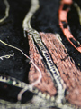
09/2007 / Region Sataroza / Petr Kuna / 2007 / pastel, Idea: fictional map, scale of map is in days (versus classical metric system)
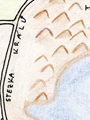
Description: But I’ve been interested in science fiction literature for a long time now, and lately I’ve really liked the Lord of the Rings trilogy, or various books focused on the mythical Atlantis. And that was the subject of my map. I wanted to create a sort of fictional map of some fictional area, a non-existent landscape with its own descriptions and names. This is the coastal area of the Satarosa region. In the map, I have included both a partial elevation characteristic of the area and a positional characteristic of the area. To represent roads, watercourses, water bodies, etc., symbols known from cartography were used. For shipping routes, the time of sailing to the indicated port is always indicated. This time is given in terms of the number of days spent on the journey, assuming a smooth and uninterrupted voyage. A similar method to the voyage time has been used for the scale of the chart – here too the scale is the number of days. I have taken the description “Here live the lions” from older real maps, where it was implied that this was as yet unexplored territory.
10/2007 / Japan / Zuzana Cahlíková / 2007 / collage,
11/2007 / Students´ places of resydence in 2007 (field of study: teaching biology and sport) / Vít Kunc / 2007 / pastel, collage, photos,
12/2007 / Mount Everest / Jakub Lysák / 2007 / crayon,
13/2007 / Small-Area Reserves in Territories of the Czech Republic in 2007 / Adéla Dlasková / 2007 / paper, plasticine, spruce needles
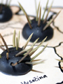
14/2007 / Around the World in 80 Days / Lenka Petříková / 2007 / Idea: representation of the world as cylindrical surface
15/2007 / Climate / Helena Kaňková / 2007 / collage,
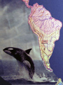
16/2007 / Memento Carto 07 / Veronika Klečková / 2007 / collage, office folder, pasted elements
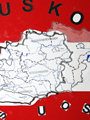
17/2007 / Wondering where to buy? Shopping Centers in Prague / Marie Železná / 2007 / map of the shopping bag